Bing
Design at Bing was an intersection of craft and science. Whereas, A/B design choices were measured by the millions and the data returned was scoured by data scientists on a weekly basis. The efficiency between teams was critical and the output was a shared understanding and success.
Roles
Management / Creative Direction / Art + Design Direction / Design
Projects
UI / UX / Design System / Visual Identity / Motion Graphics
As Principal Design Manager, my role was to lead a multidisciplinary team of designers and product partners.
My charter was to define, design and develop Bing’s internal design framework and scale the system to support an ever growing set of product requirements.
Challenge
As Bing moved to have a larger presence across numerous platforms and ecosystems an inconsistent pattern emerged. It was clear that Bing’s current design framework was interfering with efficiency. Also, fragmentation between design, product and engineering hampered communication between groups and planning.
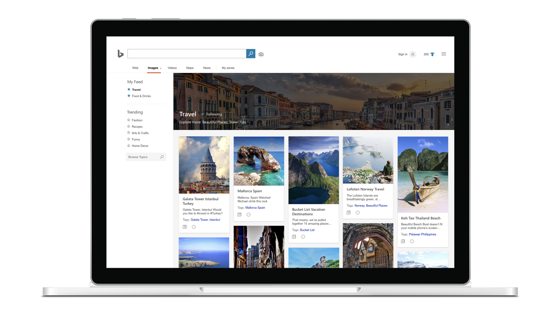
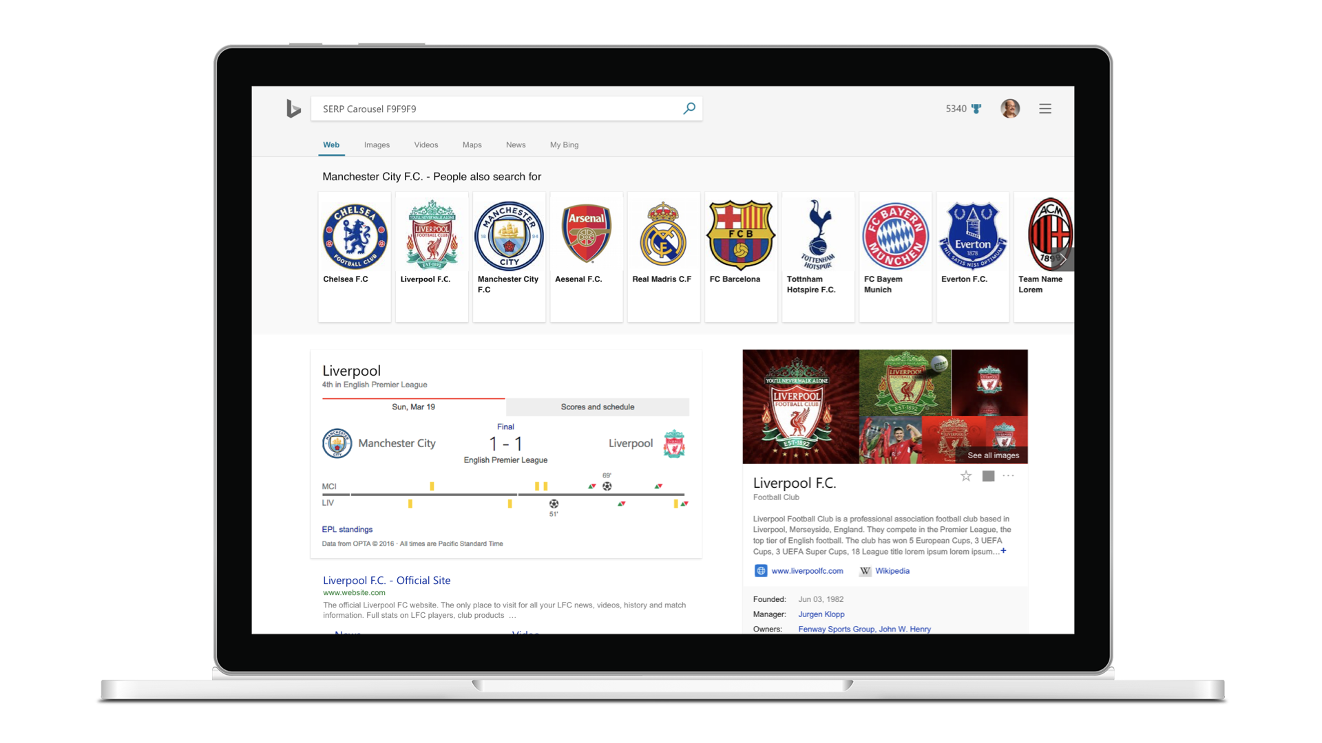
Bing covers first, second and third party experiences across multiple platforms.
Project Baseline
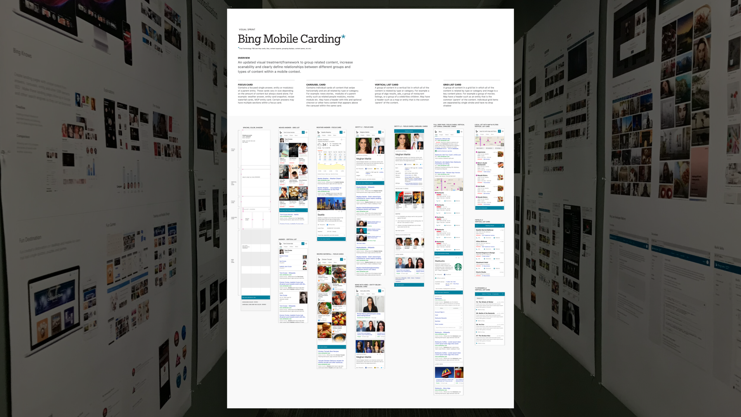
Project Baseline was named for the effort not the project. Our main goal was to create a more cohesive experience across visual language, framework, and content on Bing web and app experiences.
Approach
Bing needed to redefine the conversation it wanted to have with its users. The use of language, as users flow through the ecosystem, should be pure and recognizable. It must speak clearly to Bing’s value prop, to the visual identity, to Bing’s brand and how it ladders up to Microsoft’s brand. For Bing to achieve this the design and product teams needed to take a few steps back to understand what they stand for and possibly redefine and/or evolve the design mission.
Team
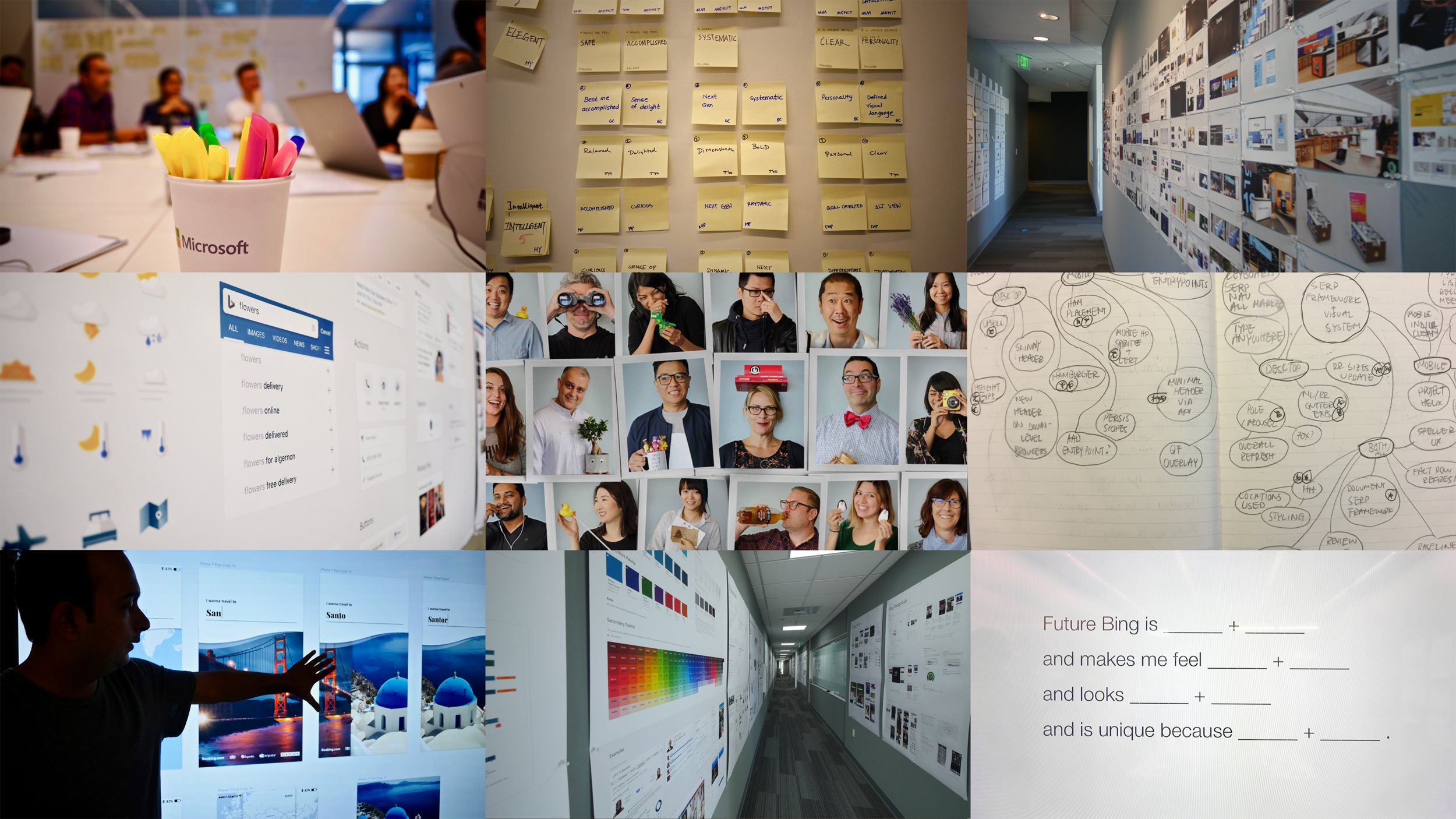
Microsoft is a global company and Bing experiences are no different. The first step in this process was to align three design teams around the world - US, India and China. At the time Bing was over 100 designers globally, but we worked in silos. In order to meet the demands of a unified framework, built for scale and speed we had work differently. We held week long workshops with the international teams in their countries, and then invited them back to the US for another week. The workshops were designed to cultivate ideas of who we are, our culture, how we wanted to work, to define our core design principles, and set an agenda to share with the larger org.
Execution
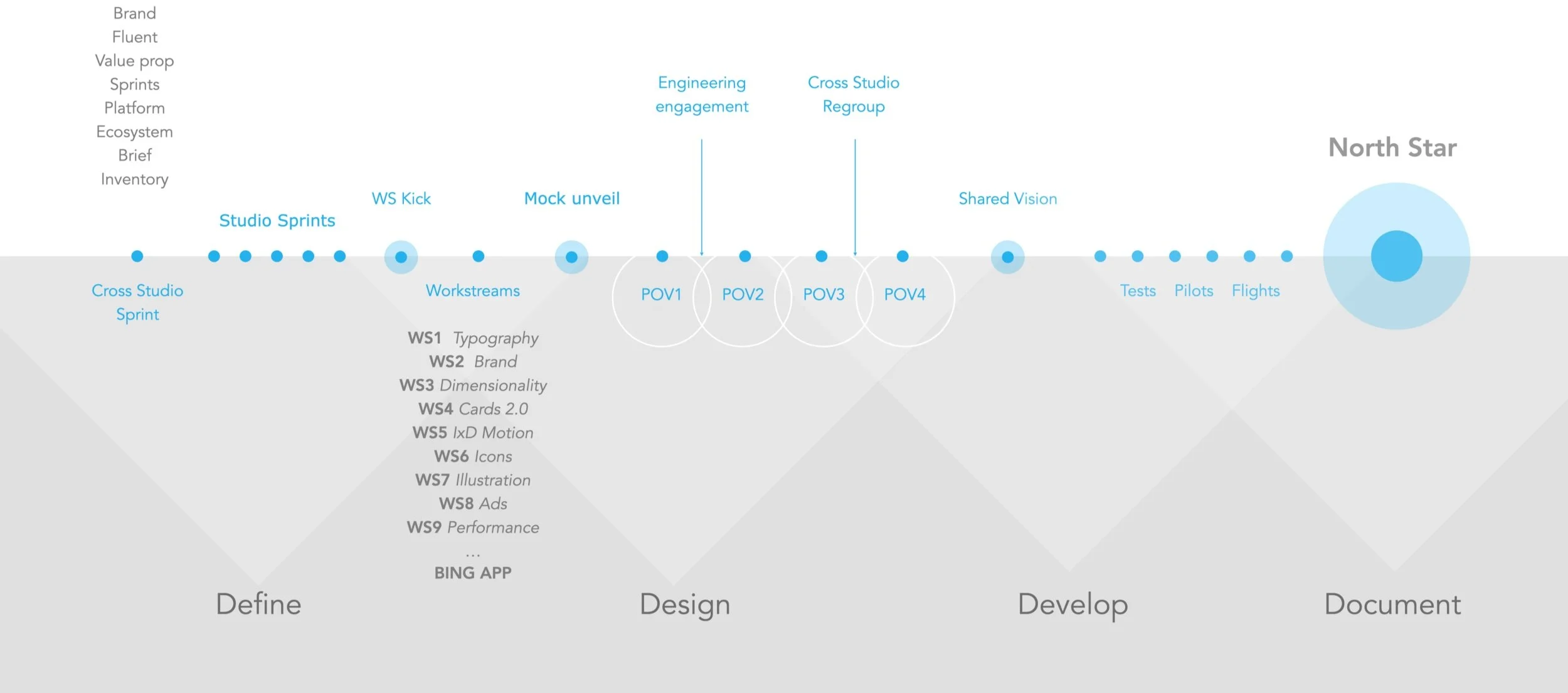
In the weeks and months that followed these framing sessions, three critical touchpoints emerged regarding the new design language. First, what will this new design language look like? Second, where will it be located? And lastly, how will we evangelize the work and progress to our org? Our strategy was straightforward, however the tools necessary to build, catalog, and express the work had to be built internally since Microsoft has restrictions on 3rd party apps and tools.
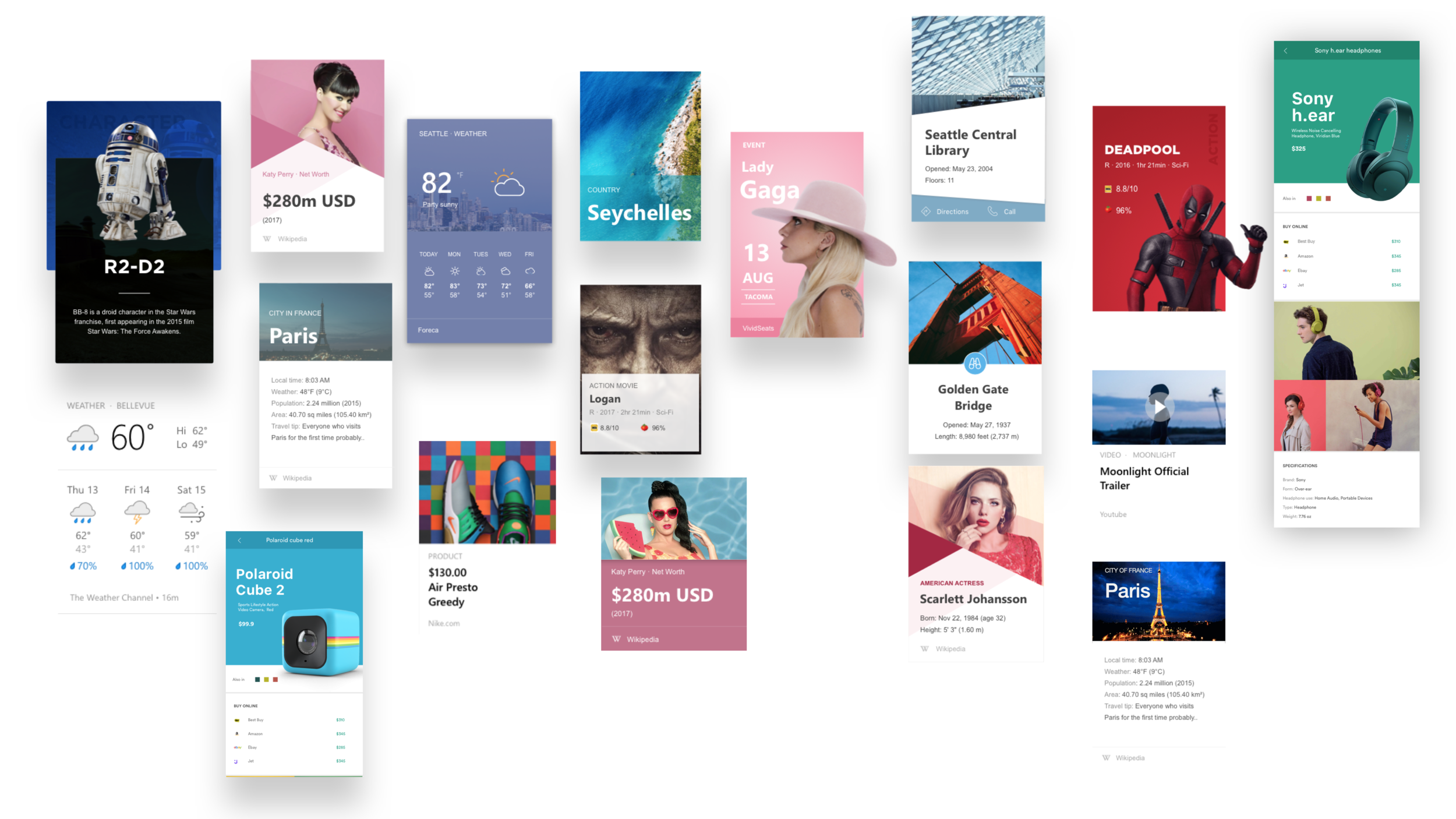
PIPELINEVisual System + HIG + Studio Site + Comm
Visual System
The Visual System is made of four major areas - Elements, Components, Patterns and Templates.
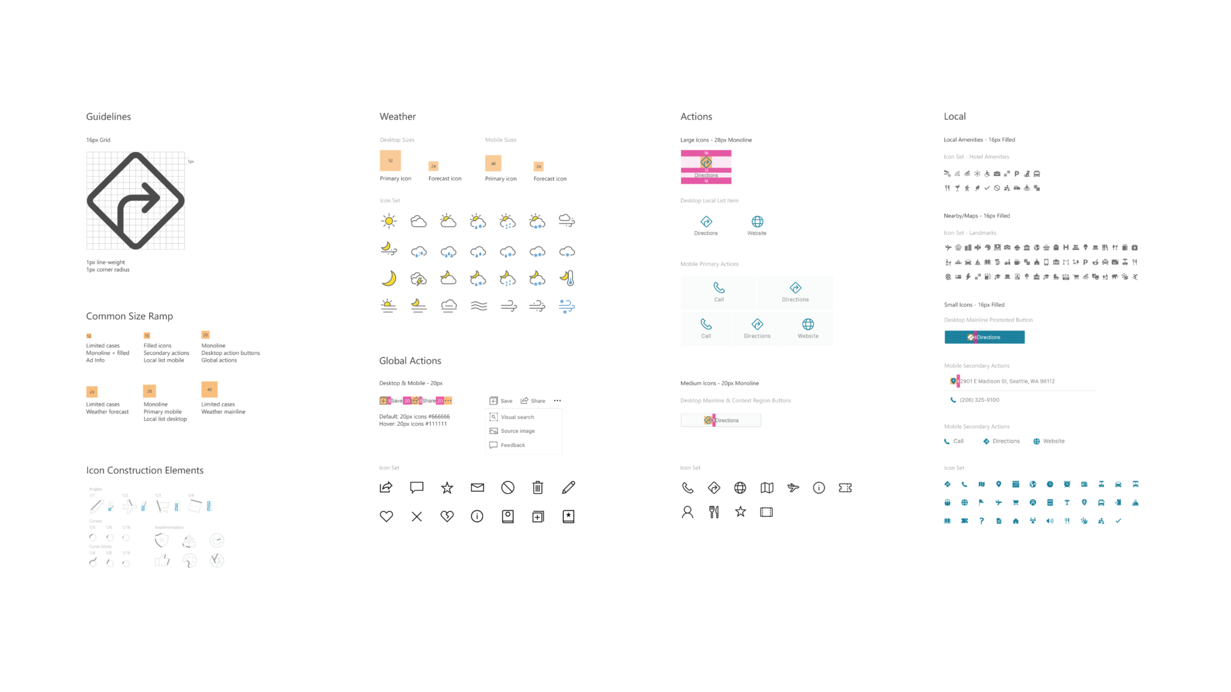
Elements
At the core of the Visual System are the elements - the framework of interconnectedness . Brand, colors, iconography, typography, imagery and motion are the building blocks to design a component. These elements align with the Bing brand and cohesive with the Microsoft brand language.


Components
Components are a universal set of underlying elements. Prior to the refresh testing was done at a granular level, moving forward we could additionally measure at the component level. This made it easier to test new features, instead of relying on individual variables.
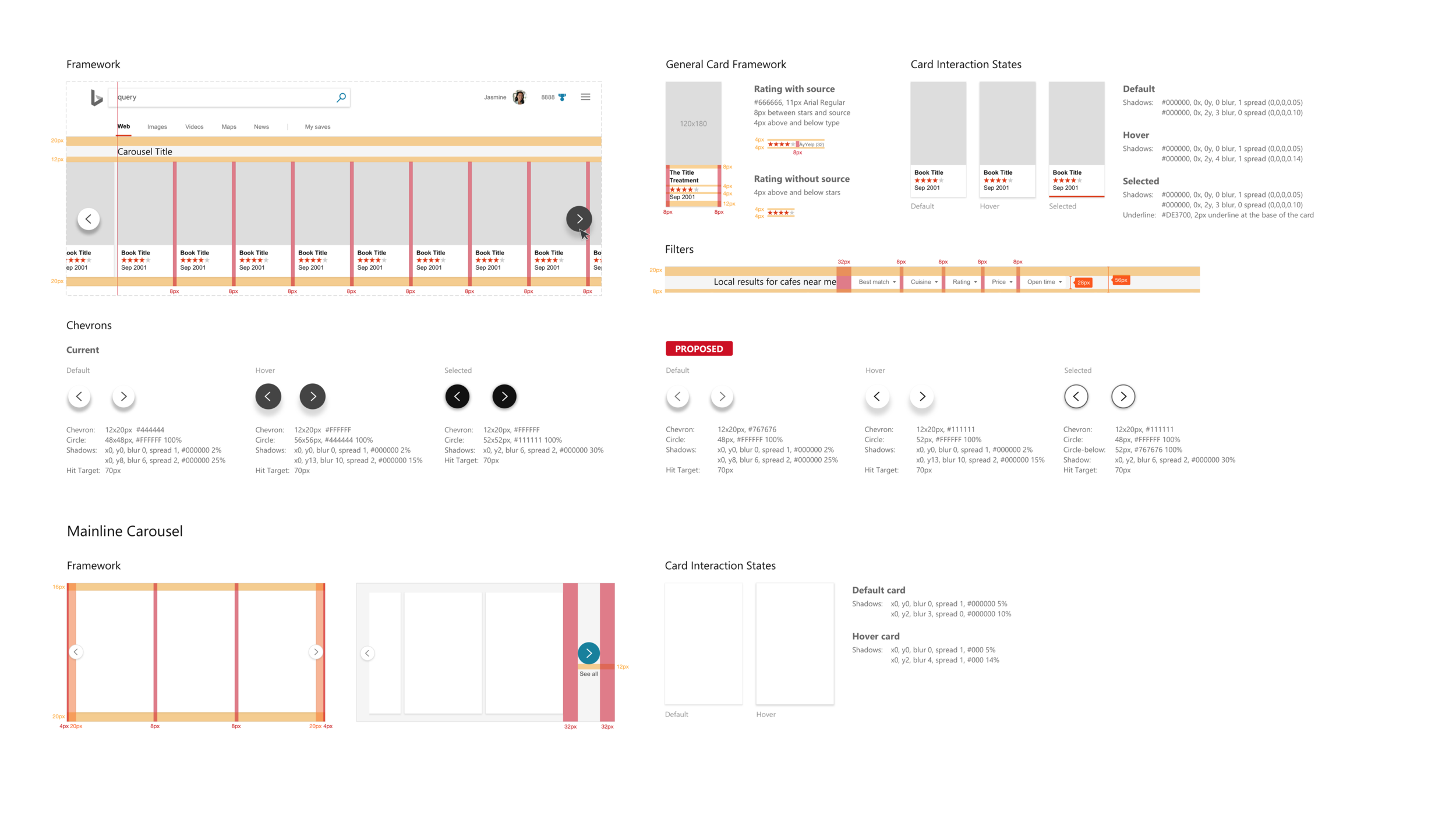

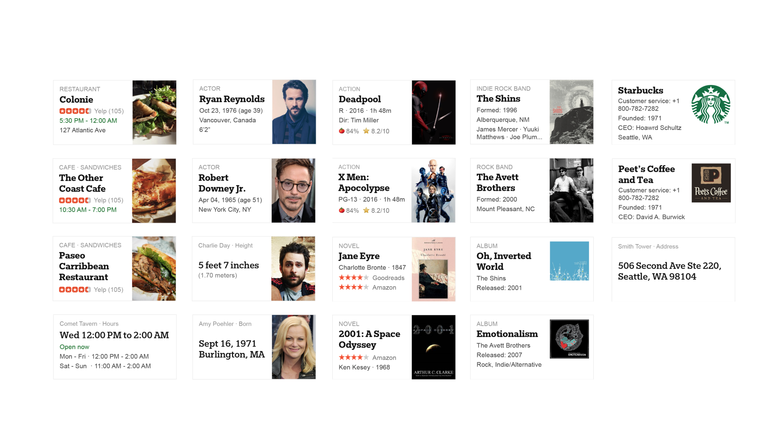


Patterns + Templates = Domains
Domains like home, images, maps or features like movies, games, and sport scores could build meaningful and measurable experiences


HIG + Studio Site + Comm
The Human Interface Guidelines (HIG) was built to house live working files. Designers could publish directly to the HIG and provide the state of the control whether in testing, flight or shipped.


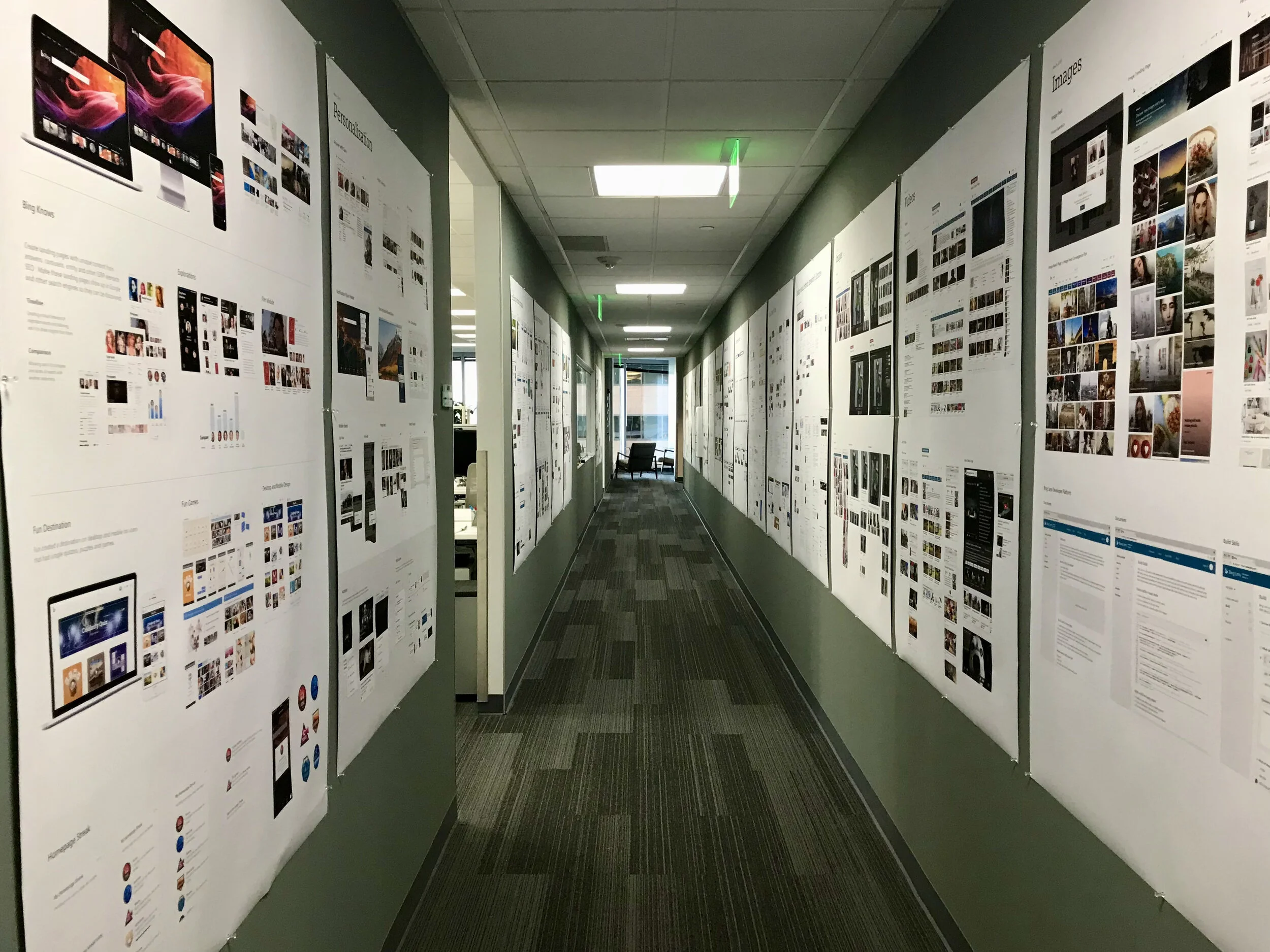
The Gallery
As part of our communication strategy to evangelize how the Design System would work across all domains, the Visual System team printed out posters and lined them to the entry hallway to the design studio. Although the intent was to celebrate our success, the hallway became a hub for designers, project managers and engineers to have conversations. A clearer picture of the ecosystem and scale of ‘everything touches everything’ was better understood by all.
“…the hallway became a hub for
designers, project managers
and engineers to have conversations…”
Before (2016) • After (2018) • Current (2021)


Solution
OUTCOMESQuantitative and qualitative improvements
Defined our design principles - Intellignet, Universal, Human and Trustworthy.
Shared vision for how design build products
Created pipeline of how elements were built, tested, and shared
Created “Gate” – a design crit focused reviewing/creating elements
Weekly flight reviews with leadership
Built an overall communication framework
Better relationship with dev, product and core ux
Reduced fragmentation between product groups
KEY LEARNINGSA style guide isn’t a design system - it needs code to live
Better understanding of overall ecosystem of products across Microsoft
Decentralizing the “truth”
Prepared for next wave (Fluent)