Marvel Unlimited App
Marvel Unlimited is a premiere digital comics subscription service, providing fans with access to over 29,000 of Marvel’s most popular and well-known comic books. Our team rebuilt the new app from the ground up, utilizing our newly established design system, Prism. Our mission was to reimagine the app and improve how fans discover and read comics. In tandem, the team was given the great opportunity to design a new logo that is more modern, feels aligned with the new app and is cohesive with Marvel comics DNA.
Roles
Brand Creative Strategy / Creative Direction / Art + Design Direction / Design
Projects
UI / UX / Design System / Visual Identity / Motion Graphics / Marketing / Social
The following work was completed by Disney Media Entertainment & Distribution Technology team in partnership with Marvel Entertainment. The projects I’ve selected were the focus of my time, direction, involvement, and design.
GOAL
Design an authentic digital experience for Marvel comic book fans.


My role was to partner with Marvel brand, editorial, marketing and lead the creative effort to define a design language that captured the culture of comics in the Marvel Unlimited App.
Phase 1: Discovery
Respect the Craft
We examined possibilities for integrating subtle, comic-influenced textures into both the visuals and the user interface of the app. This approach aimed to pay homage to the artistic skill and craftsmanship invested in the creation of each Marvel comic.
Considering that the majority of our readers favor comic books released after 2016, we had to be mindful of the nostalgia we infused into our work. This pushed us into a direction that felt more modern and in line with current styles.
New Format, Familiar Faces
Today’s stories are beyond the hero; they have a cultural impact, they’re diverse, topical and controversial. Likewise, the aesthetic has grown more complex in the use of patterns, color, gradients, typography, etc.
Perhaps the biggest difference is technology. Printed comics may be the origin and most familiar, but they simply cannot accomplish the capabilities of a robust digital format.
Cloud and local storage allows for tens of thousands of issues at a fan’s fingertips.
High resolution screens are capable of displaying colors that are impossible to print, and turn once static images into animations.
Personalization opens a new discovery track to other characters, authors, and artists.
New and untapped formats for reading, sharing, personalization and discovery give the audience a familiar but deeper connection.
Phase 2: Explorations
Through several rounds of exploration themes emerge showing the balance needed between legacy and a modern execution.
Angles & Textures
As we explore ways to bring dynamic qualities within the app by use of the angle, we aim to capture when, where, and what degree is most impactful and consistent across pages/elements.
Exploring ways to capture the unique texture of comic book art as a subtle pairing with the modern, clean aesthetic. Striking a balance without becoming too reminiscent of the classic comic art style/nostalgia
Personal studies to capture the boldness and richness of comic books and characters.
Phase 3: Execution
Our goal was for the product's design language to be just as captivating as the comics themselves, while also ensuring that any solution could accommodate a rapidly expanding library of content.
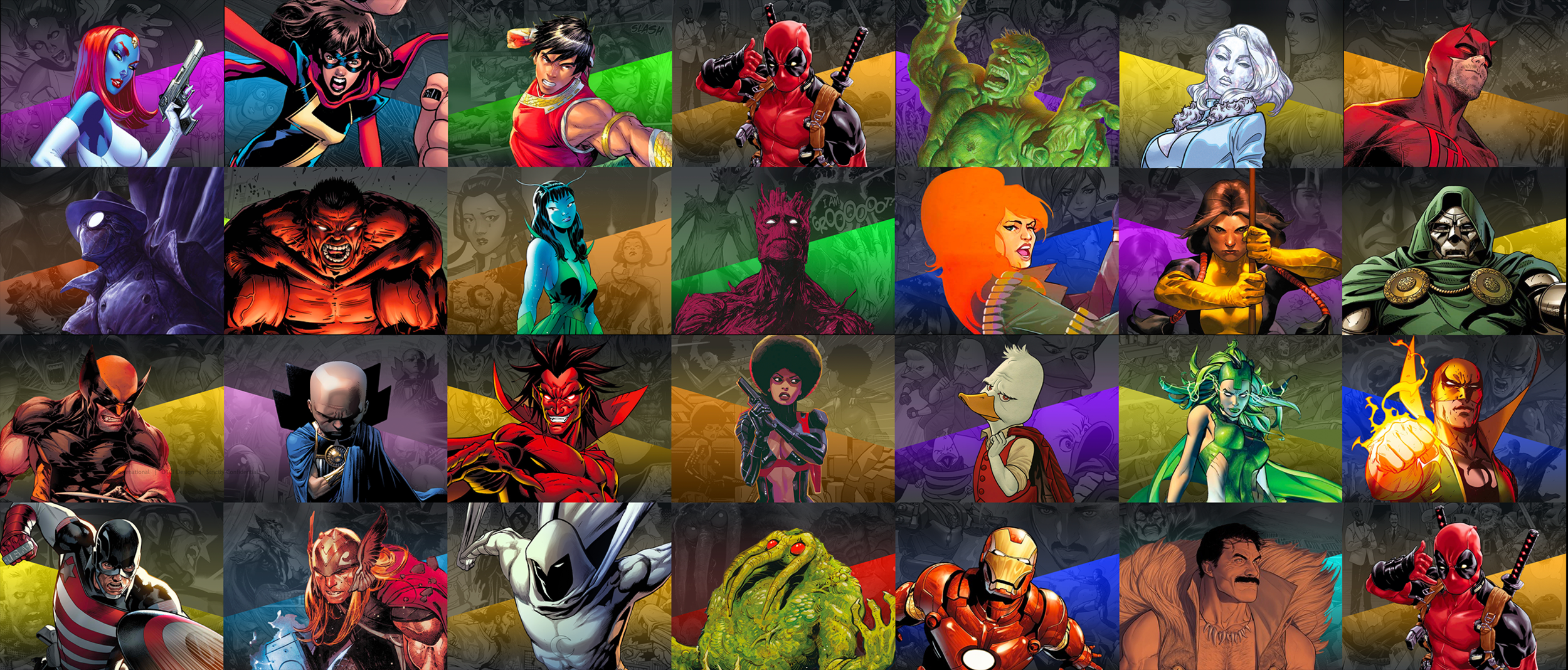
Character Art
Marvel Unlimited has a library of over 8,000 characters. We highlighted 900 of the most popular characters with unique key art incorporating the character, a colored angle, and a texture comprised of the character in action.
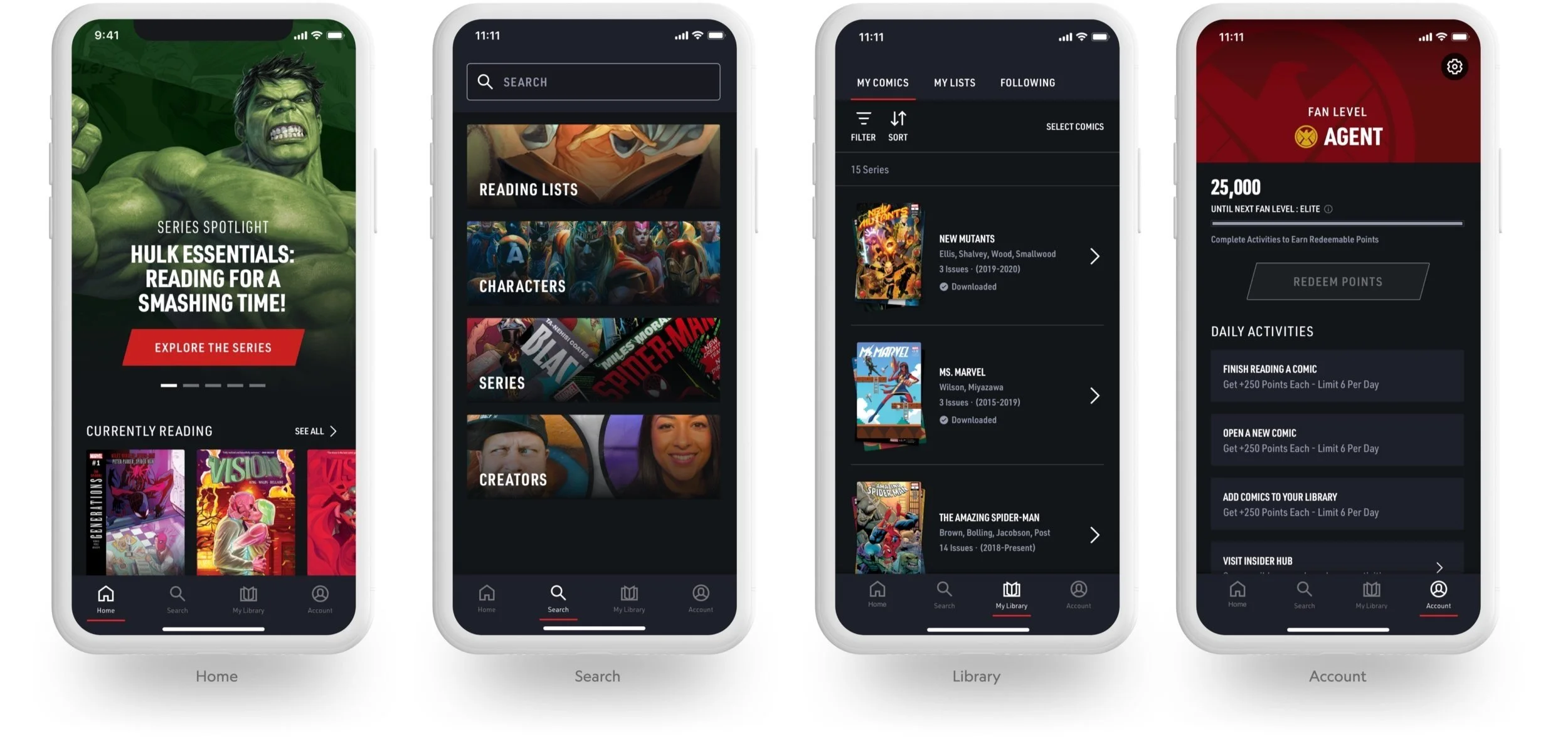
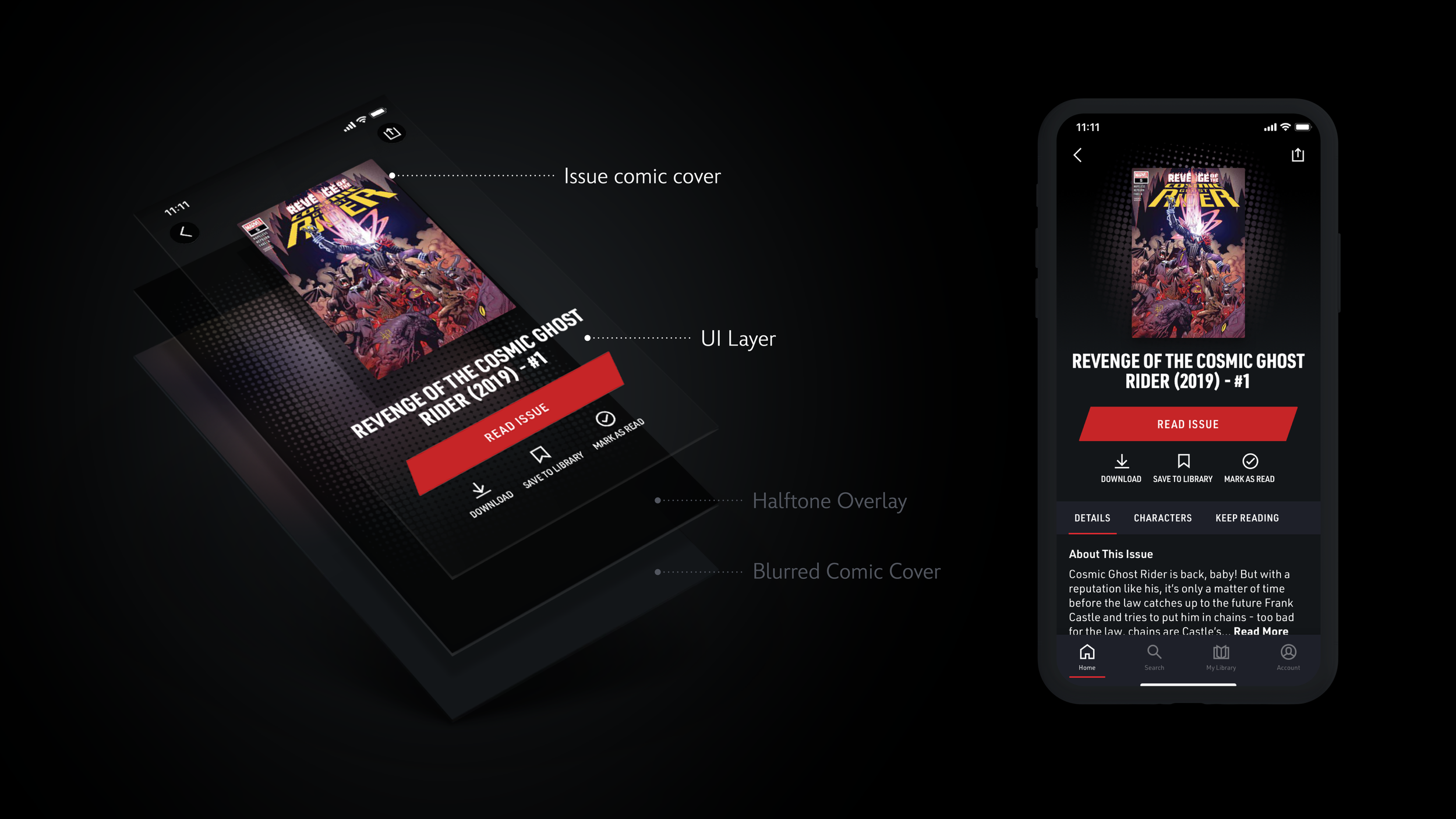
Detail Pages
Discovery and consumption primarily flows through detail pages. We focused on these pages to highlight not only the content, but the supporting design language behind each and every issue.
We built an automated way to give a custom look to every comic detail page. A series of stacked overlays, each with a programmable variable, resulted in a visual that was unique to each issue, and scaled to any asset.
Innovative solutions such as these, that scale, are time and cost effective, and meet product goals are the best blend of brand, content and technology.
Detail Page Anatomy


Content Cards

Typography

Color

Iconography

Brands within the DMED portfolio, including NatGeo and Marvel, often encounter numerous overlapping scenarios, such as search, video playback, onboarding, subscription, and more. Historically, we've tackled these in isolated silos. To create high-quality, customized experiences efficiently, we must revolutionize our design approach. The Prism framework represents the first step toward discovering universal solutions for shared challenges, allowing us to allocate more time to genuinely innovative and impactful work.
Entity Pages
For Magazine Detail pages, or what we call “Entity Pages”, we leveraged Prism’s entity page templates which informed our placement of the title, metadata, and secondary actions.
Search Landing Page
The Search Landing Page is the full-page experience accessed when Search is an element within the Primary Navigation. This variation of the page allows the user to browse content of interest to them without navigating through the site’s architecture.
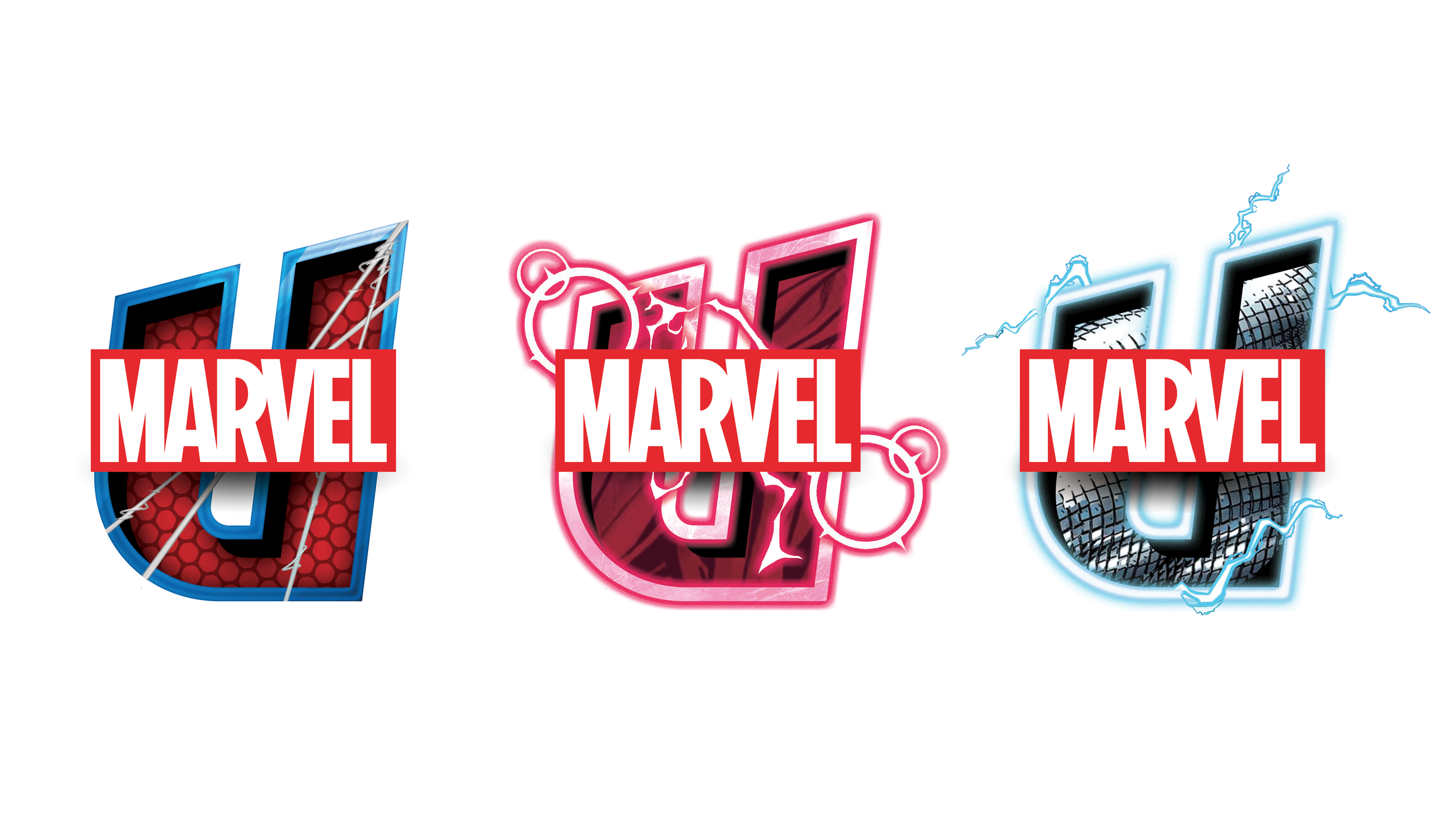
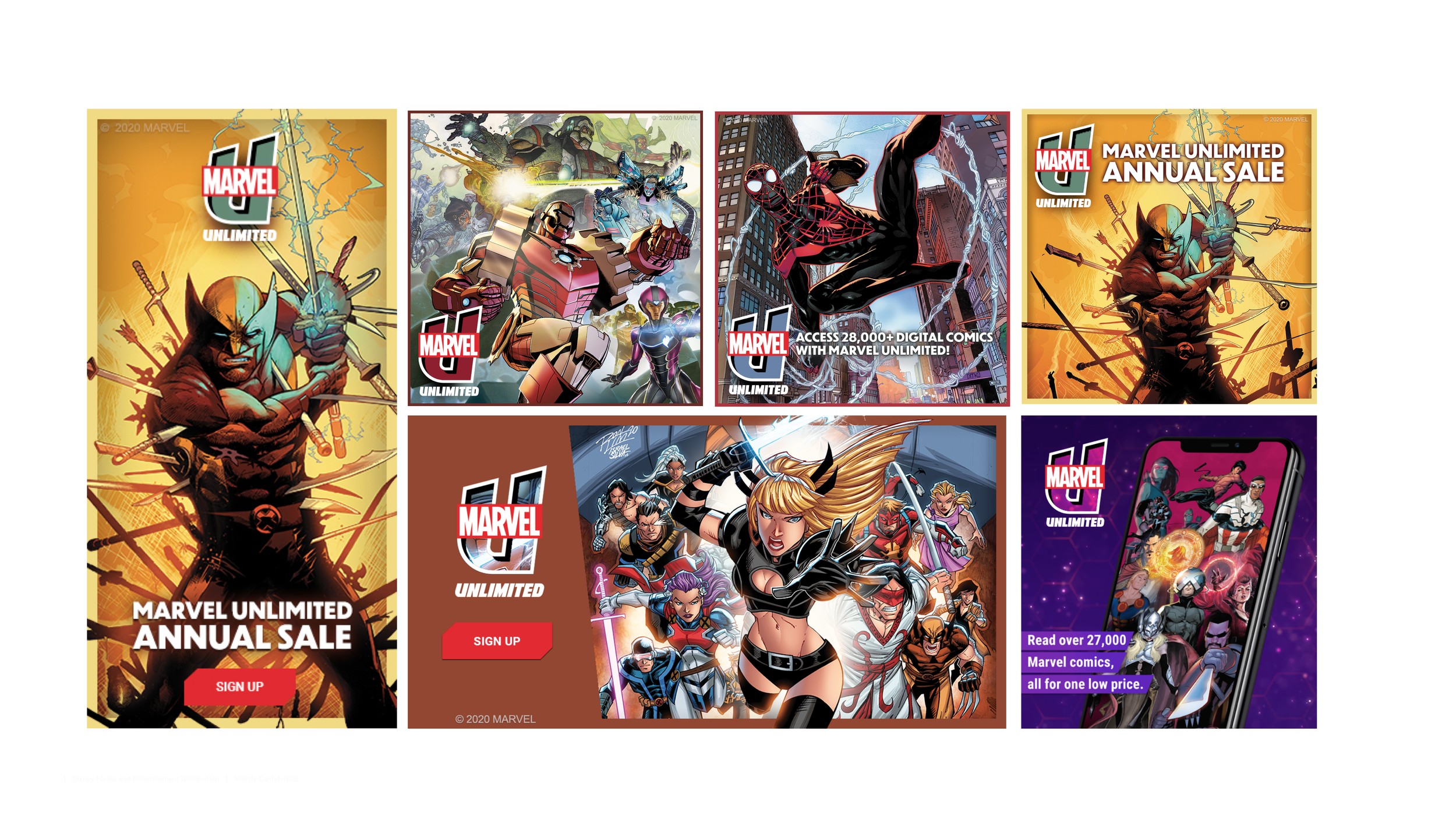
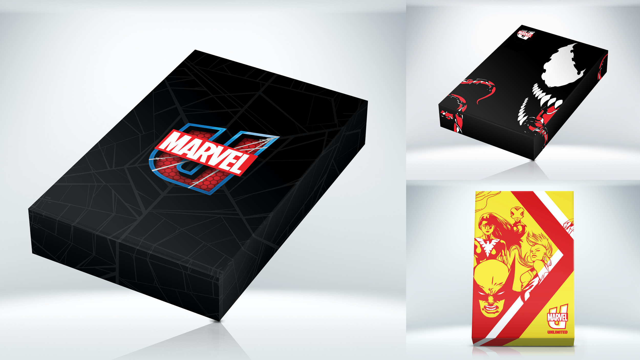
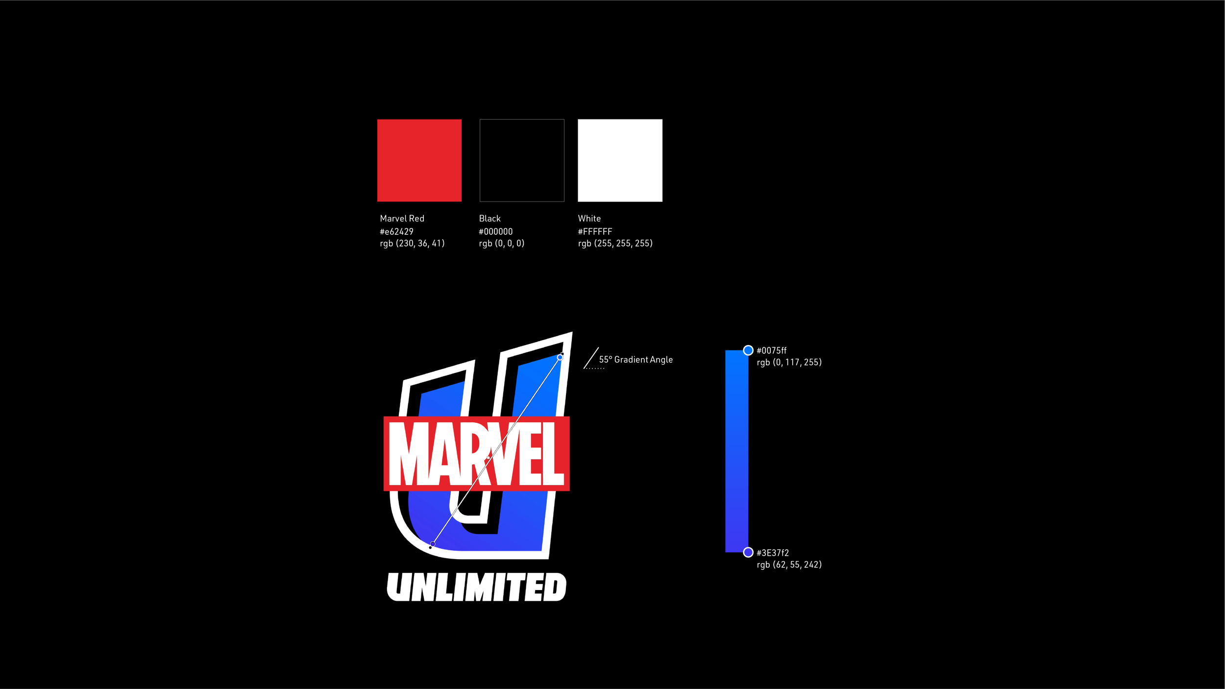
Identity
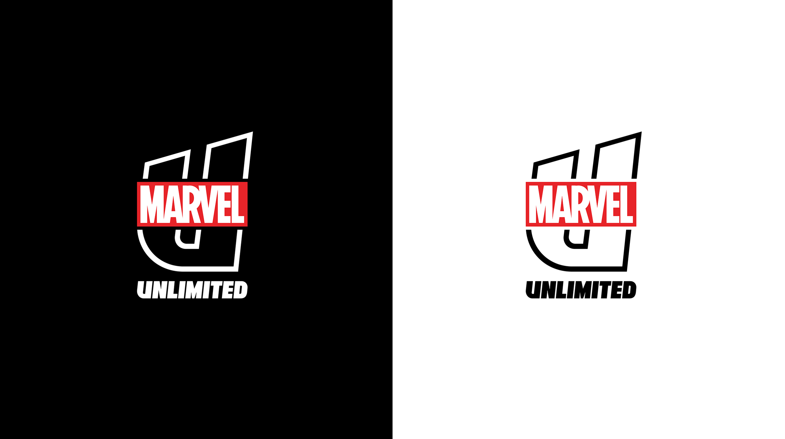
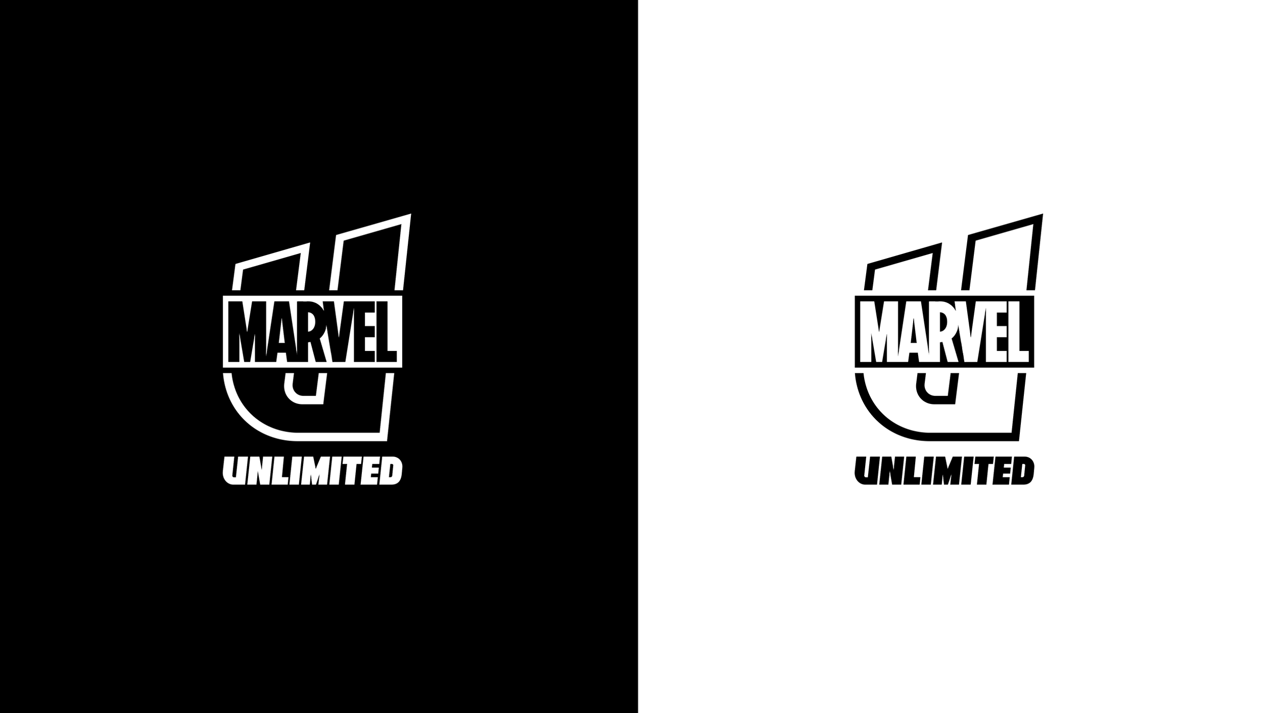
In tandem with app development, the DMED design team was tasked to create a new logo for the Marvel Unlimited App.

I worked with the Marvel brand and DMED design teams to help create a comprehensive identity that worked as a stand alone logo, as well as a surface to promote Marvel intellectual property.
To meet the needs of the new product as well as marketing initiatives the new identity needed to be:
Modern and feel aligned with the new app.
Integrated with the Marvel ecosystem.
Cohesive with Marvel comics dna.
Flexible to meet product and marketing needs.
Unique to heighten brand equity.

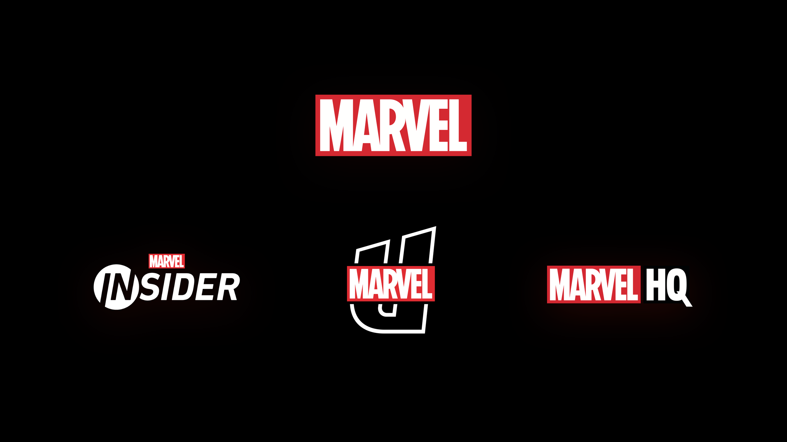
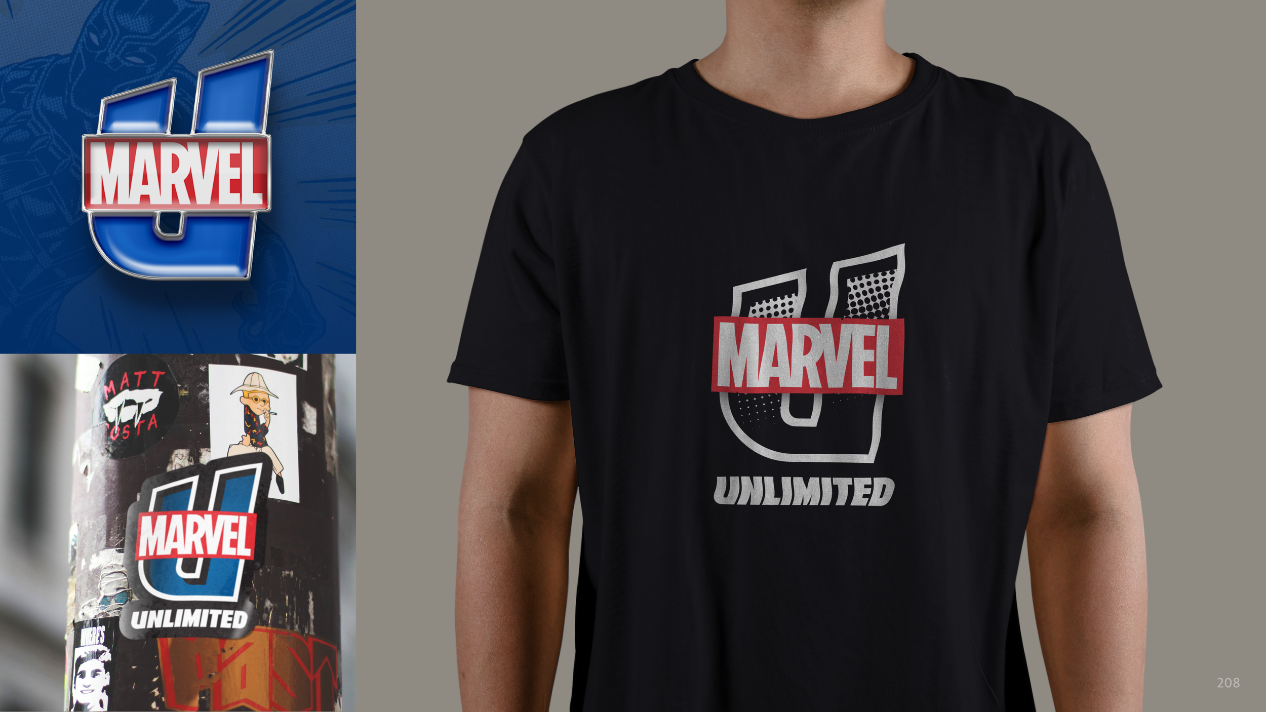
Although the prior identity met the needs of the app, it did not sit well in Marvel’s ecosystem of brands, or have much brand equity.

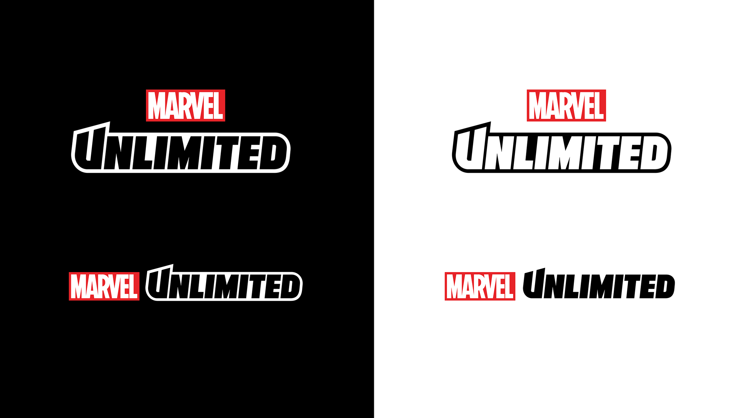
Logo-616
Marvel fans love an Easter egg, and the new identity has one of its very own. The angle of the italic and top cut are 6° and 16° respectively. Marvel fans will recognize this sequence of numerals - 616. In the Marvel Comics multiverse Earth-616 is the primary continuity in which most Marvel Comics stories that we know and love take place.

Splash
On first launch, and subsequent cold launches fans will be greeted by all new animation introducing the new logo. The stacking of an endless series of Marvel characters pulled right from the pages hints at the breadth of content beneath.


Process
Over the course of eight weeks the team defined and designed five top candidates for consideration that met the goals of a modern and flexible, cohesive with comics DNA and memorable to heighten brand equity.