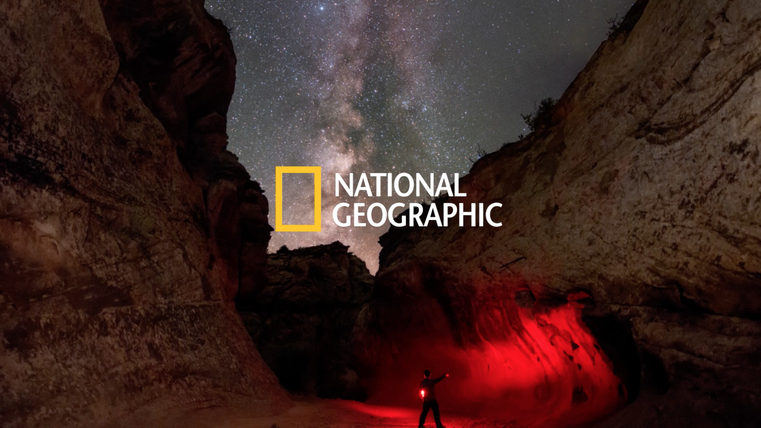
National Geographic App
The National Geographic app, a global direct-to-consumer product, offers a rich and personalized experience. Launched in February 2021, the app provides access to National Geographic's extensive content, including articles, photos, videos, and TV channels, with new features like offline viewing and an in-app digital magazine.
Roles
Creative Direction / Art + Design Direction / Design
Projects
UI / UX / Design System / Visual Identity / Motion Graphics / Typography / Iconography / Marketing / Social
The following work was completed by Disney Media Entertainment & Distribution Technology team in partnership with National Geographic.The projects I’ve selected were the focus of my time, direction, involvement, and design.
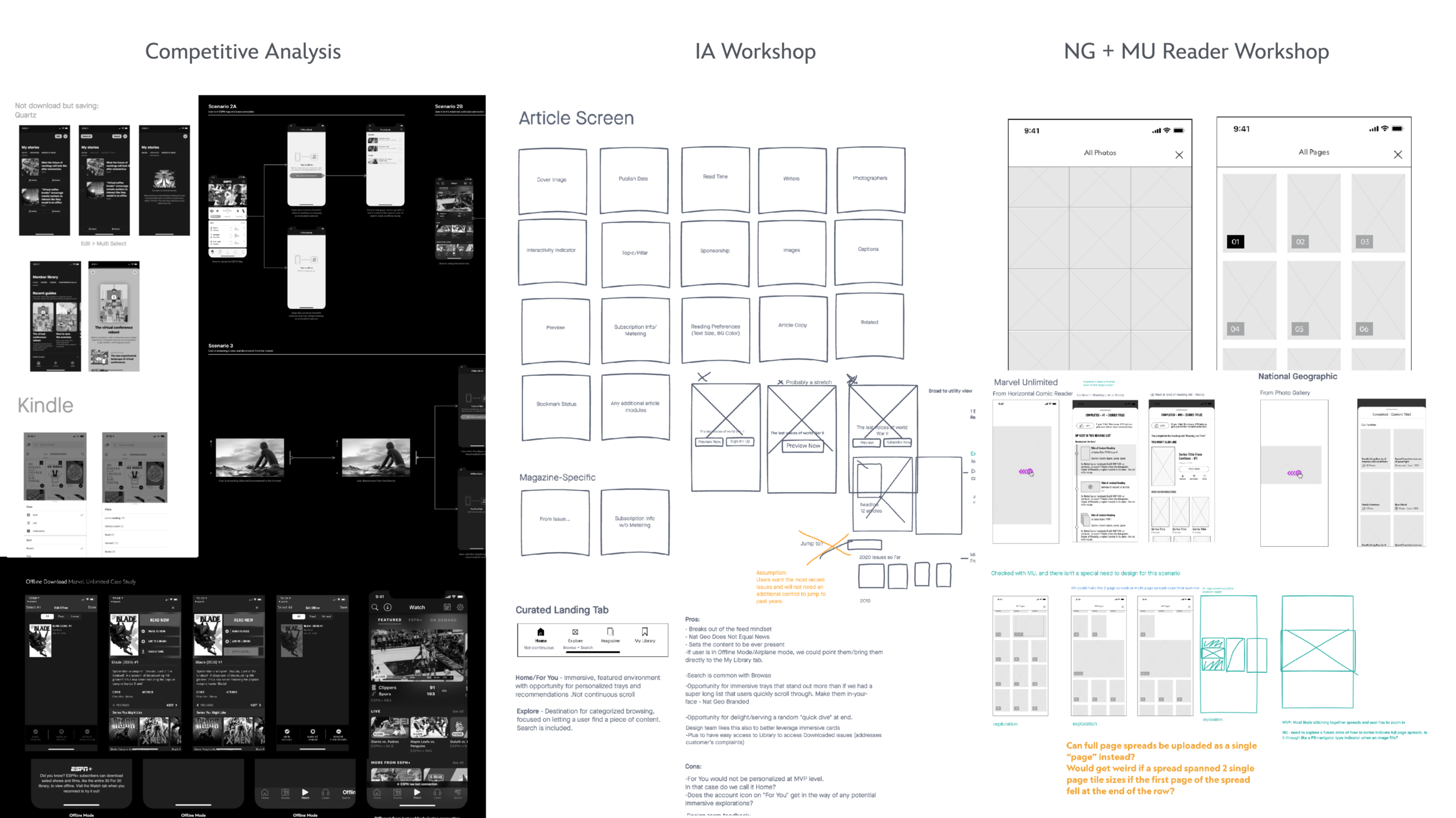
In spring 2019, Disney acquired 21st Century Fox, bringing National Geographic under its ownership. A year later, Disney Media Entertainment and Distribution (DMED) began a major overhaul of the National Geographic app for iOS and Android.
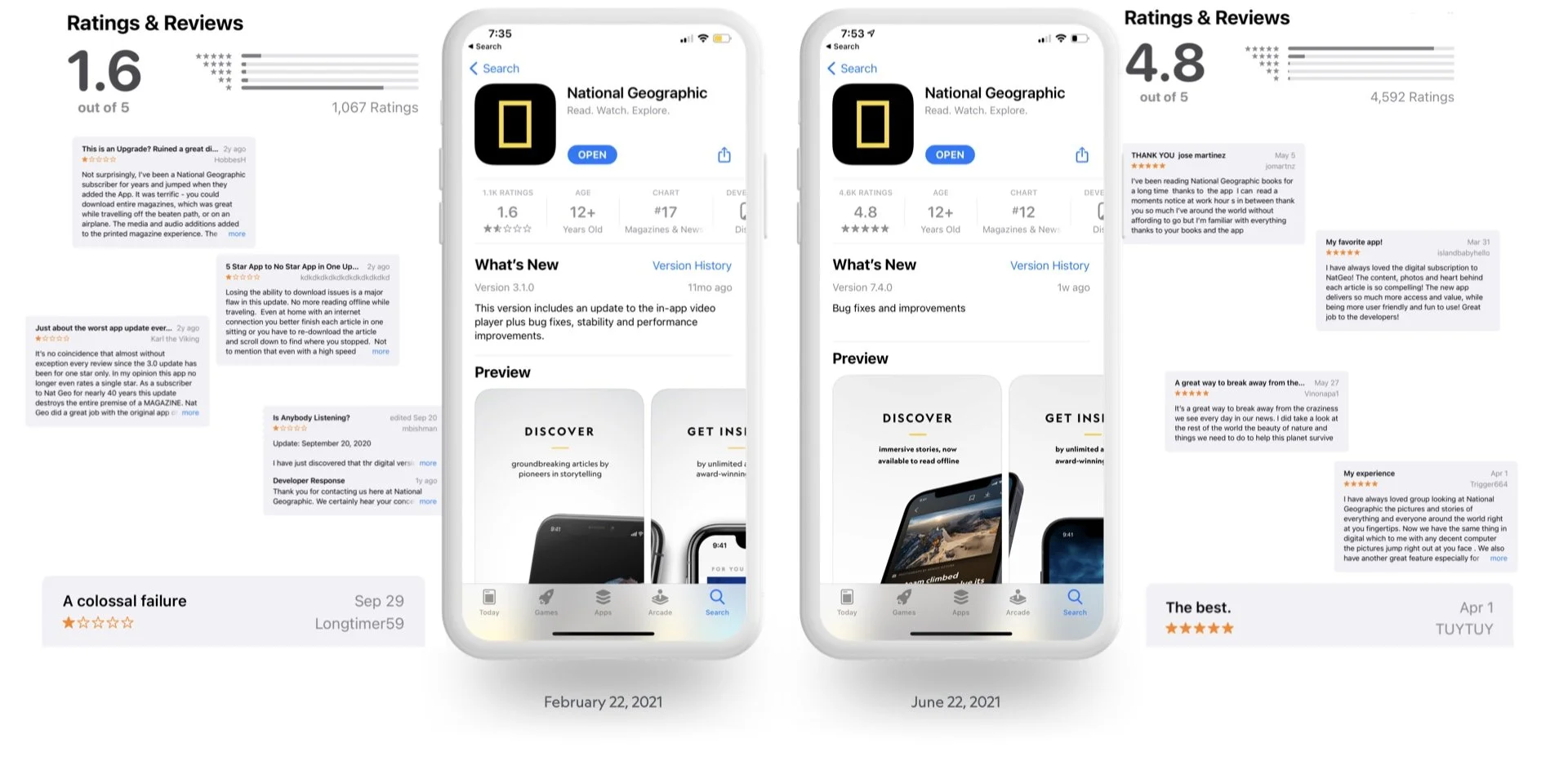
Due to a lack of features and updates, the app's user rating was very low when our team began the project. We recognized challenges and opportunities with this redesign.
Righting a Wrong
Previous redesign upset users due to removal of downloadable magazine content
Building the Plane…
Ground up redesign on a new native platform and incorporating guidelines as they were being defined
Timeline
Quickly spun up a new team to deliver on tight deadlines
New Brand, New Relationships
First National Geographic project for most of the team and fully remote
Geographically Diverse
Working with teams across the world
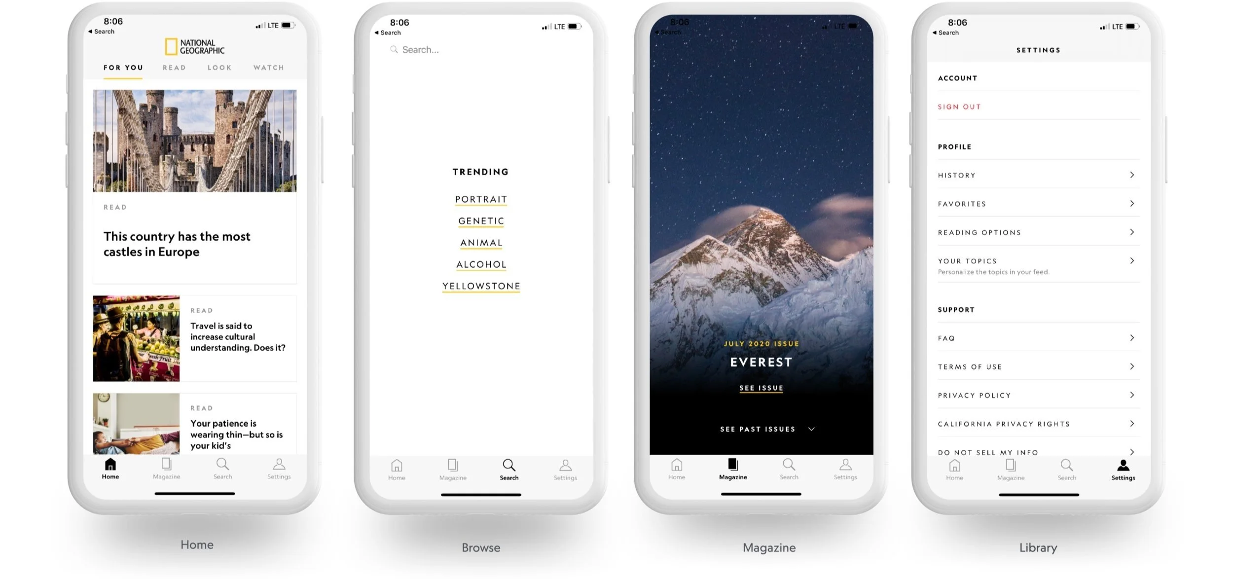
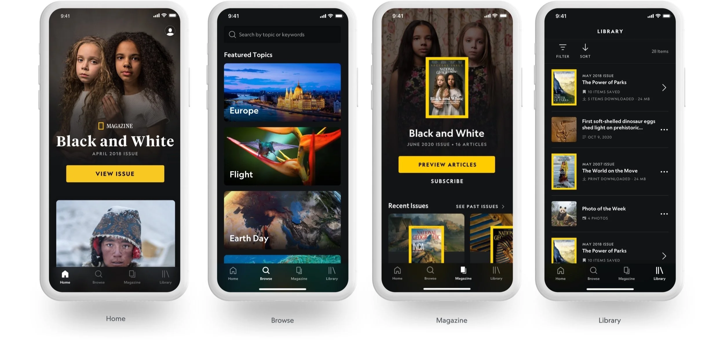
National Geographic app prior to 2021 refresh.
Brand
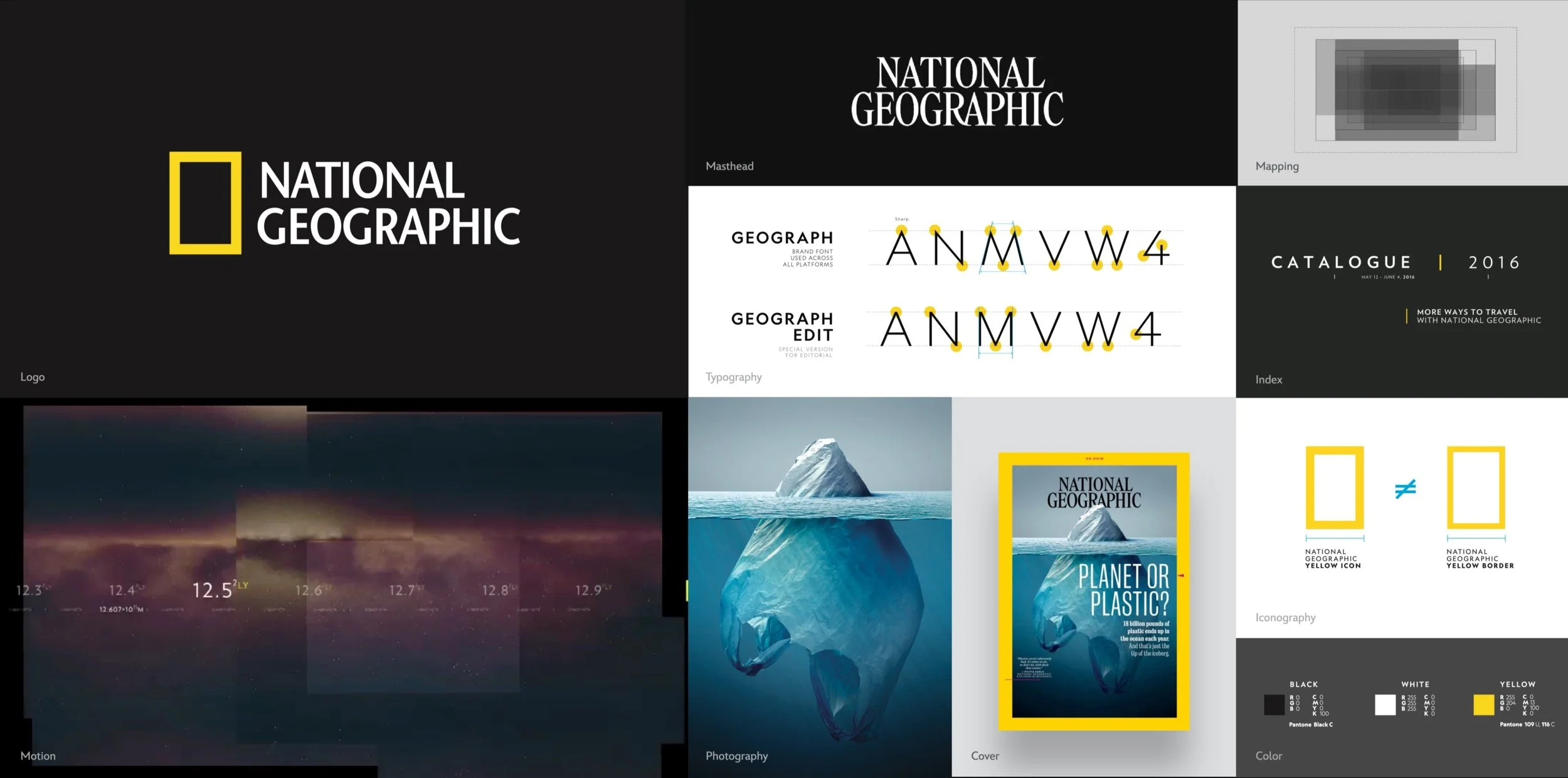
As Creative Lead, I partnered with National Geographic’s brand, editorial and marketing teams to tell their newest story of adventure.
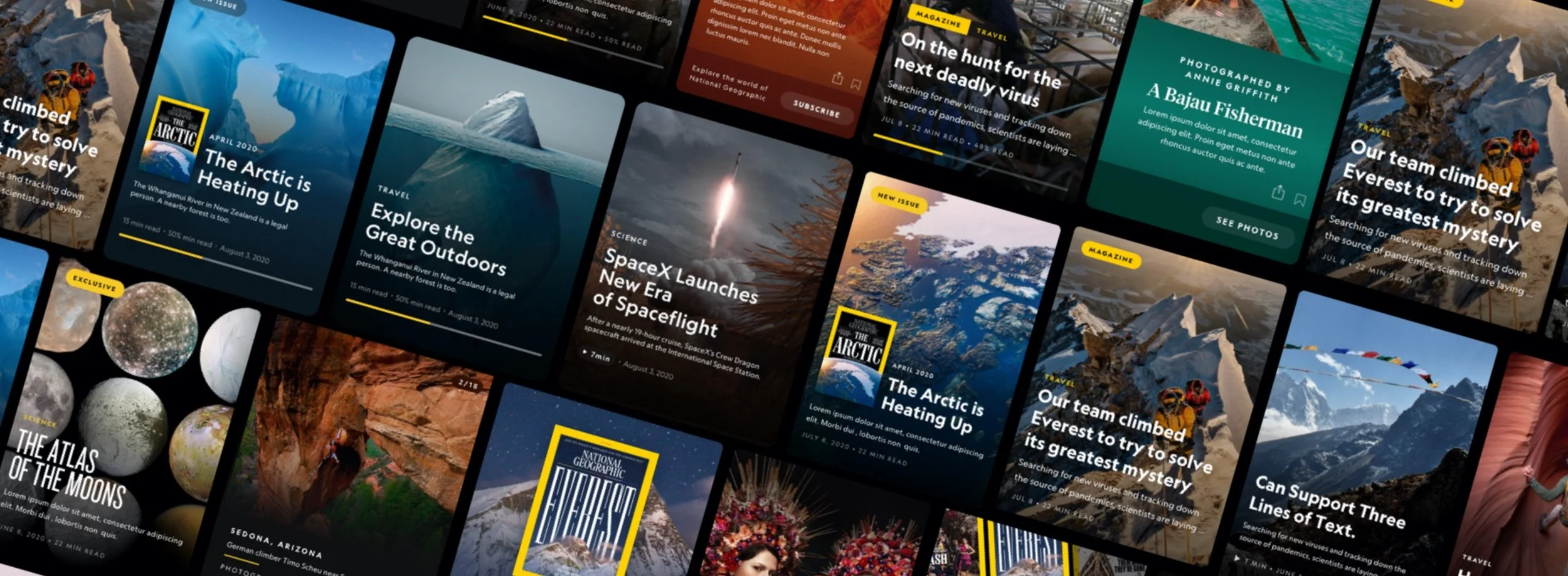
Since 1888, National Geographic has been a leader in exploring and protecting our planet, a legacy reflected in their brand's award-winning photography, writing, and timeless design language. We emphasized the brand's typography, color, motion, and overall design language.
Product & Design Goals
As with all subscription services, we’re always looking for ways to grow subscribers. We wanted to try some new strategies that pivoted from what Nat Geo had done in the past. Once we were satisfied with an overall direction we began to execute keeping our goals in mind:


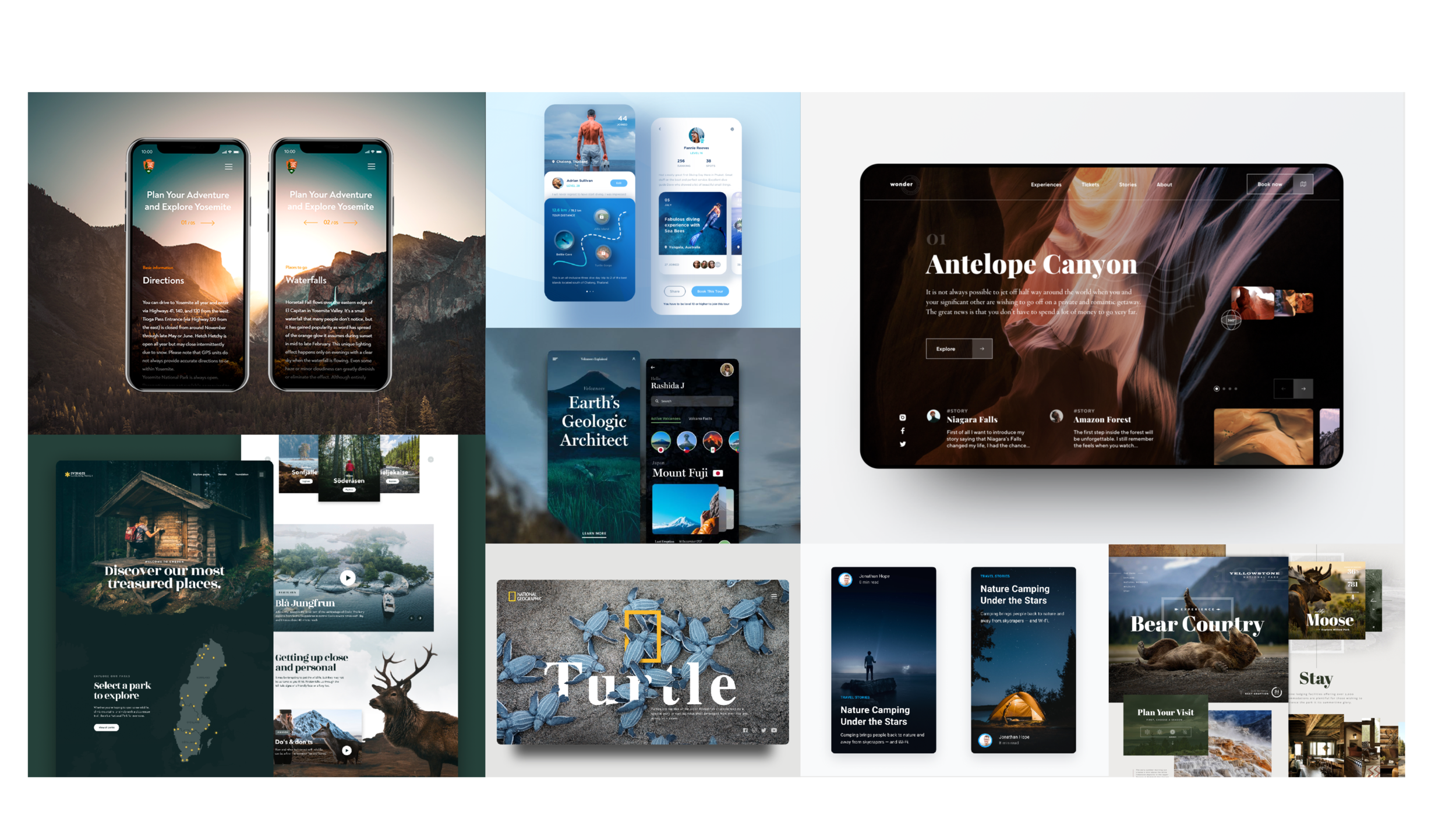
Process
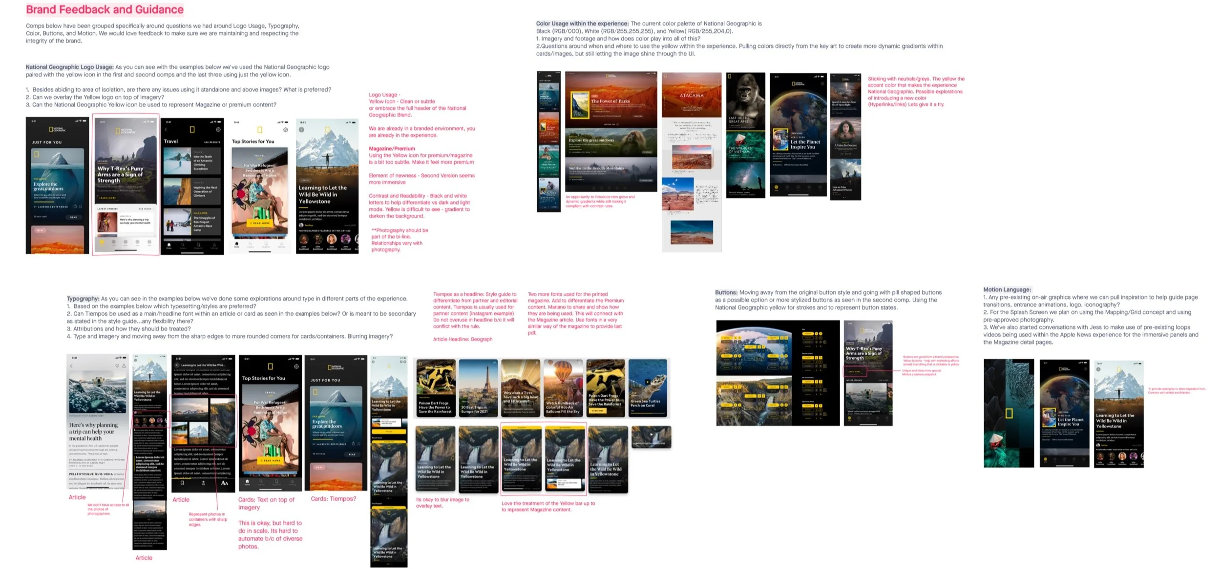
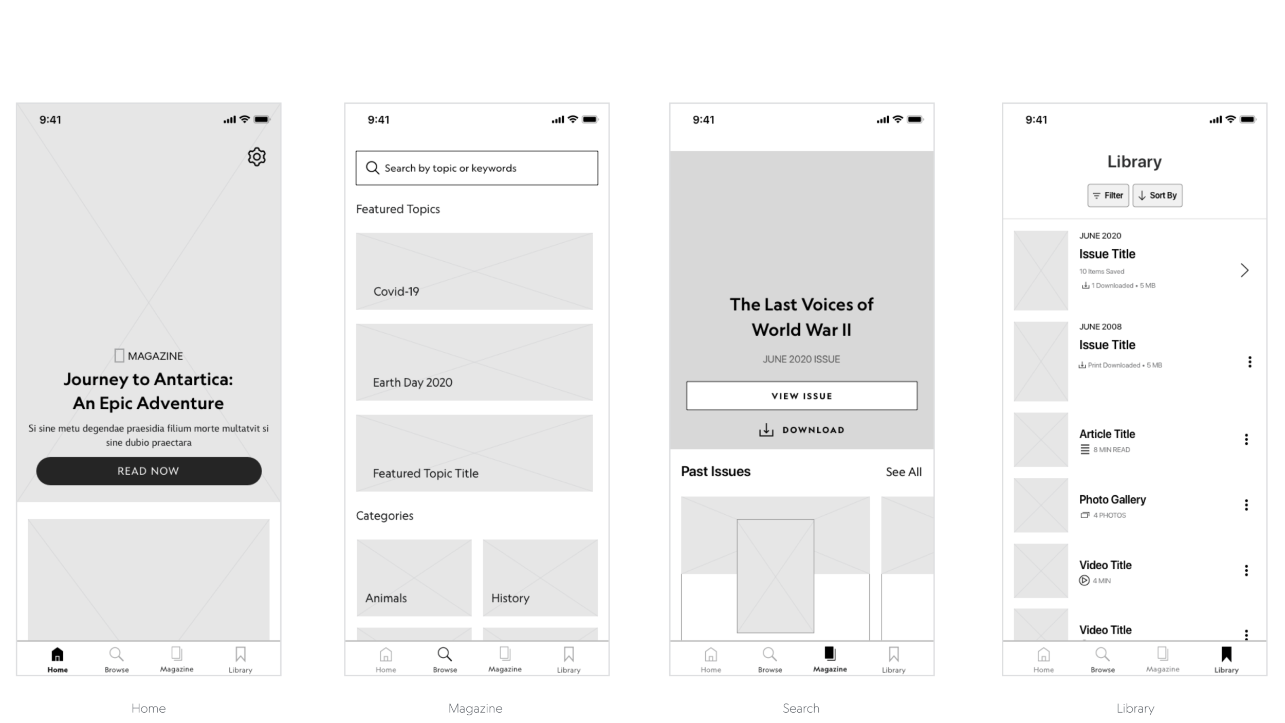
The project started with visual sprints and mood boards from online sources. We focused on large photography and strong typography. After brand alignment, we applied the design to the architecture and UX wireframes.

Brands like NatGeo and Marvel within the DMED portfolio share many common design challenges (search, video, onboarding, subscription, etc.) that have historically been addressed in isolation. The Prism framework aims to unify solutions for these shared issues, enabling more efficient and innovative design work. The Prism framework represents the first step toward discovering universal solutions for shared challenges, allowing us to allocate more time to genuinely innovative and impactful work.
National Geographic was the first to utilize DMED Technology’s Prism design framework
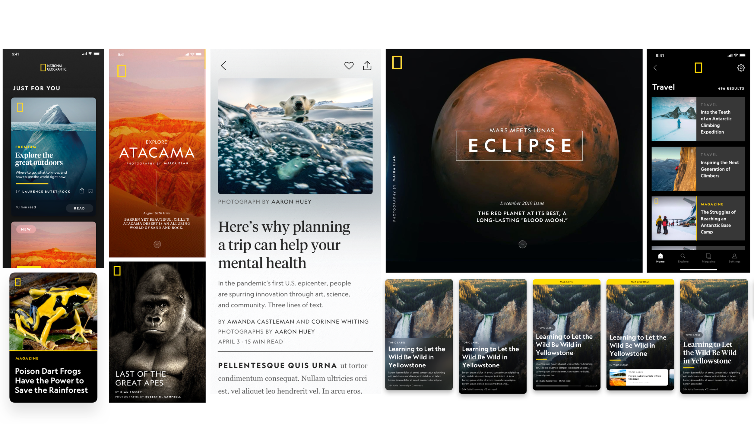
Entity Pages
For Magazine Detail pages or what we call “Entity Pages” in Prism, we leveraged Prism’s entity page templates which informed our placement of the title, metadata, and secondary actions.
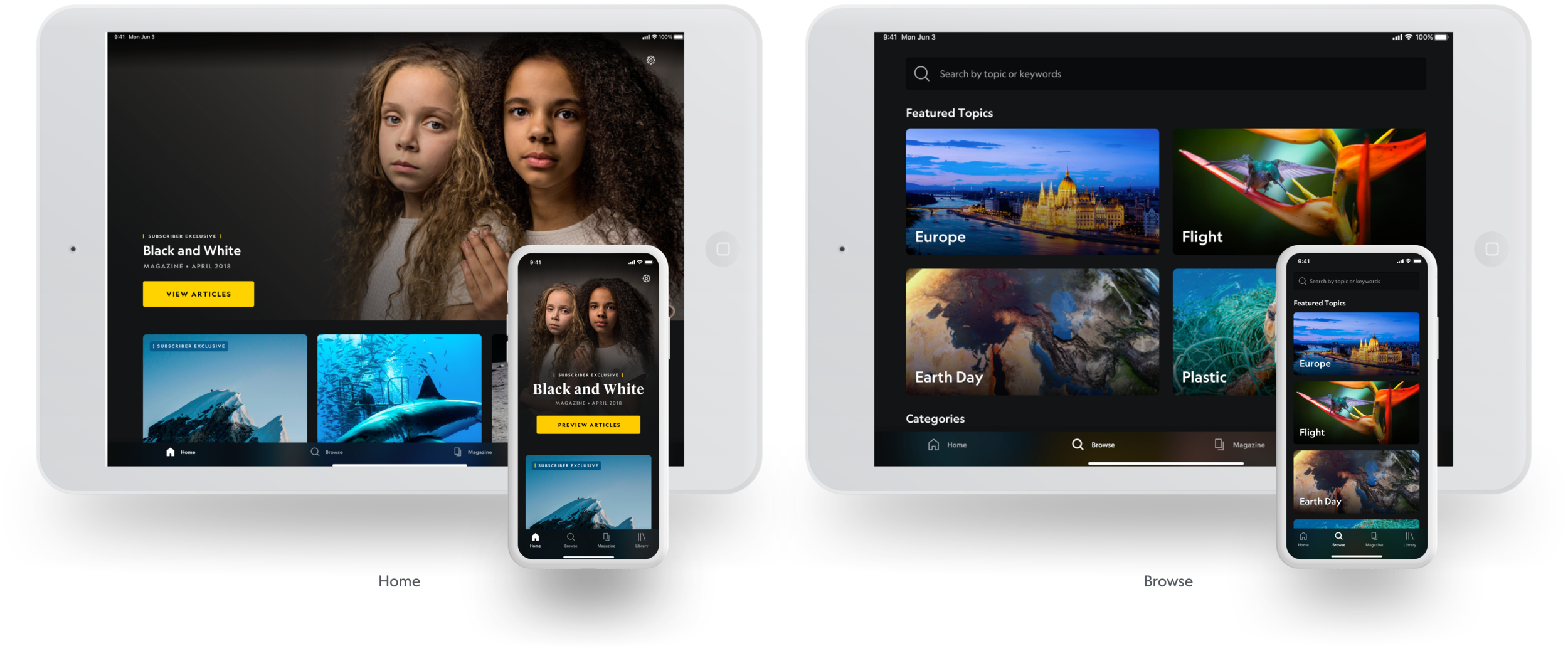
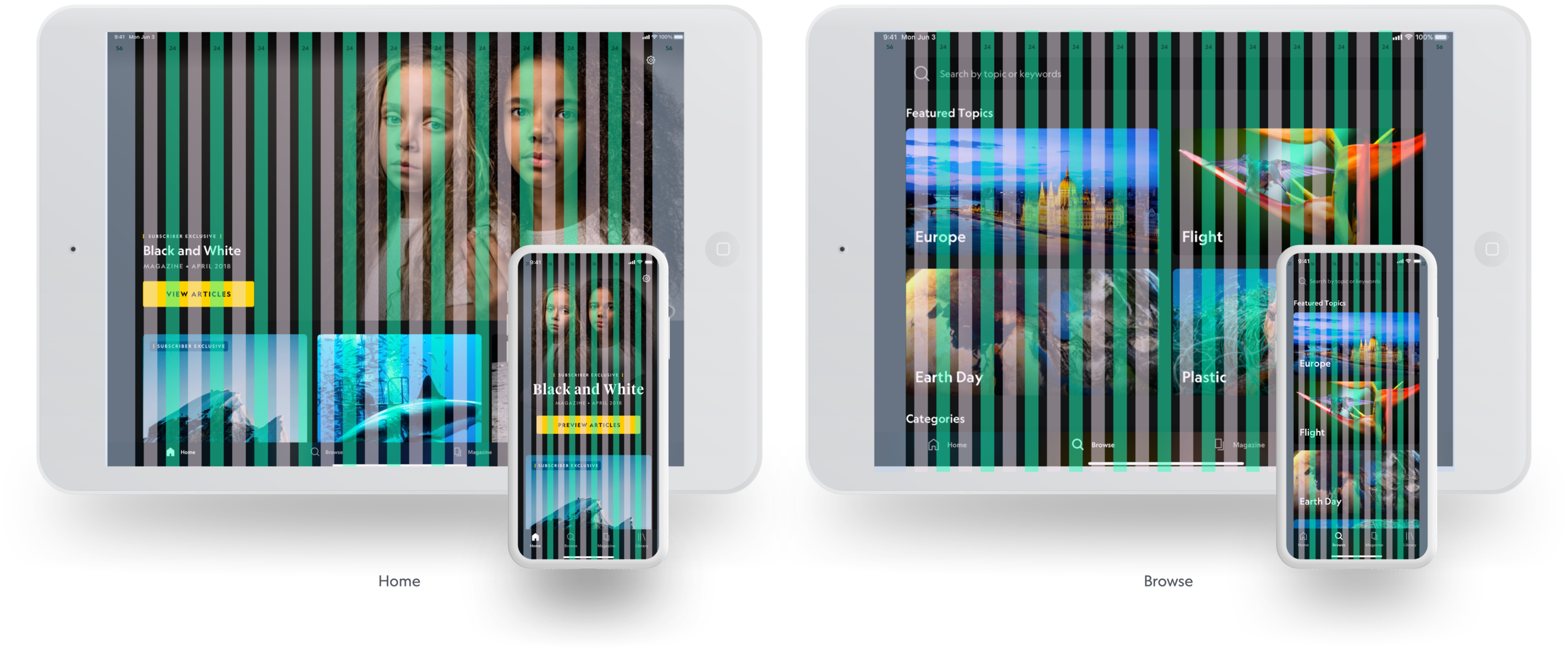
Responsive Grid
Our app is also fully available on tablet devices, thanks to the grid documentation provided by Prism. Here you can see our Home and Browse tabs on a tablet device.
Video Player
The video player utilizes Prism’s preexisting framework. Since this is the first implementation of Prism’s video player template, it was truly a large collaboration between the engineering and design teams.
Through thoughtful craftsmanship, we bring about moments that can be striking, enchanting, or flawlessly fitting.
For example, part of the refresh was to update and scale the app’s iconography. To do that, we used our Prism icon grid and standards to guide us. Taking it a step further, we add a brief animation that not only validates touch feedback, but also adds charm to the brand and keep our audience engaged and wanting more.
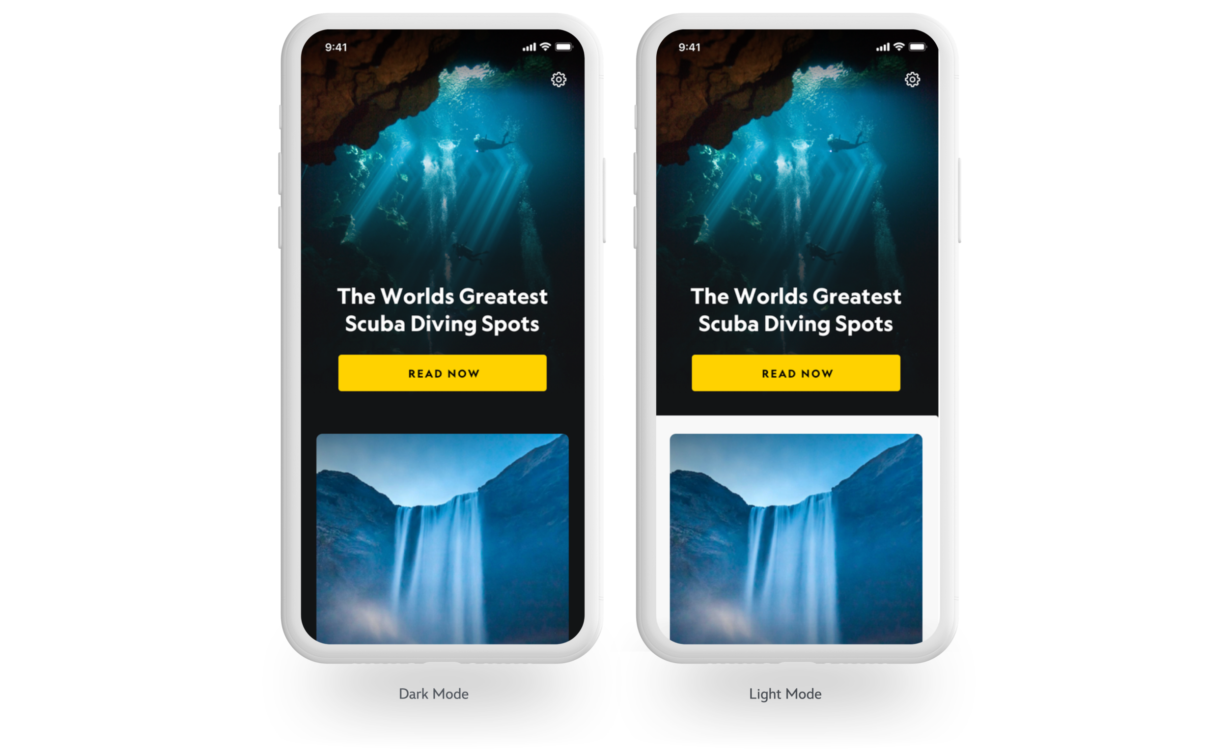
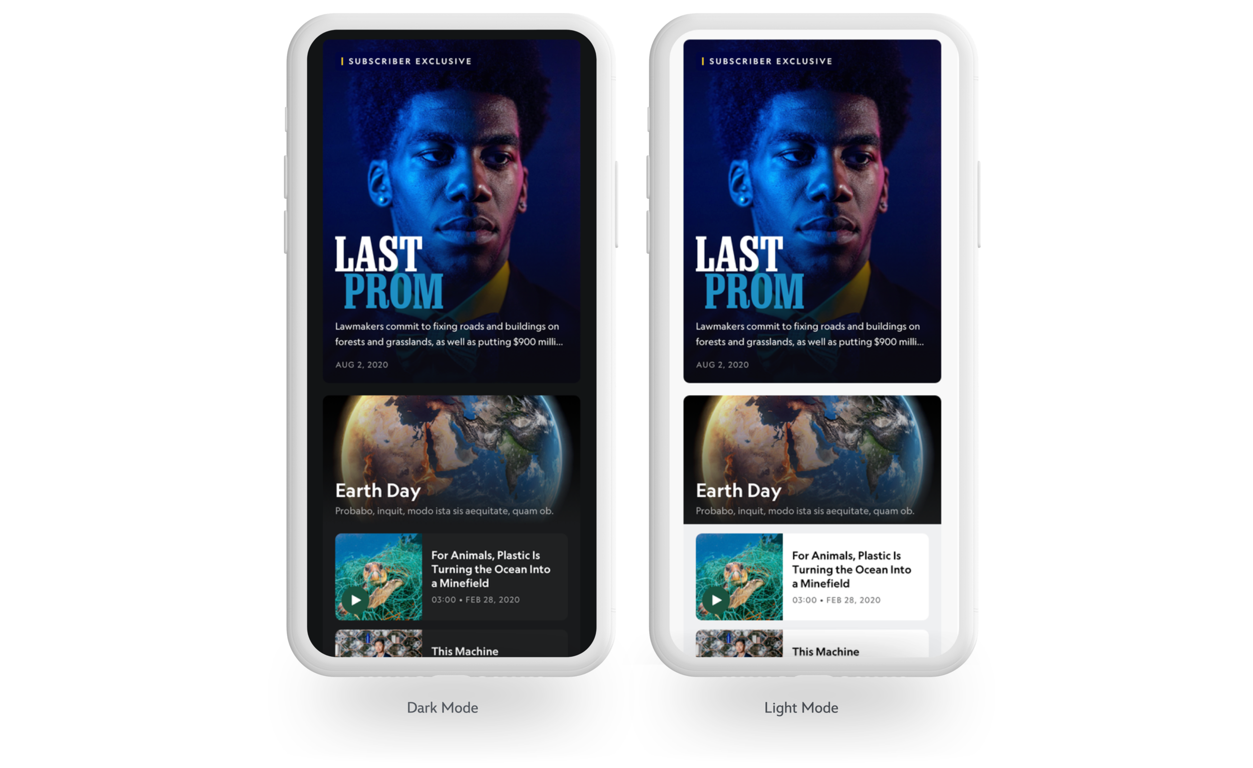
Dark / Light Mode
Although dark and light mode can be performed natively on many platforms. We worked closely with the Prism Design System team to implement a custom dark and light mode.
This allowed for components to be switched while others stay fixed. This was an important detail so that some brands could control specific areas.


Subscriber Exclusive Badge
Outside of making sure the photography was front and center it was important to the business and brand team to streamline the communication to users as to what content is only available to paid subscribers.
I worked closely with the brand team to create a badge that felt premium and on brand. In homage of the original “National Geographic” Magazine logo. I partnered with NatGeo’s Print Editorial team and typographer to create this.
Ultimately this wasn’t used, but nonetheless it confirmed the dedication from both NatGeo and DMED Design that we shared the same passion for excellence.
Follow Me
National Geographic is no stranger to social media. On February 17, 2021 the app was announced through many media touchpoints including Instagram, Facebook, Twitter and LinkedIn. With over 204 million followers as of January 2022, National Geographic's Instagram account is among the most popular globally. Leveraging this reach, I led a motion team to create an announcement trailer for a new app, which ran. on launch day across various social media platforms.